
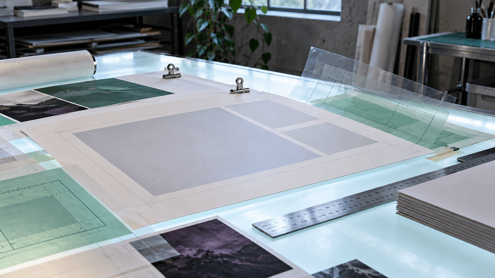
Article · Sep 29, 2026
White Space Has to Be Budgeted
Why white space in web, print, packaging, and bilingual layouts is a production decision, not leftover emptiness.
8 min read
White space is often treated as whatever remains after content is placed. Better layouts reserve it early so images, calls to action, bilingual copy, print marks, packaging edges, and mobile crops can all breathe without breaking the message.
In this article
- 01The margin is often spent too late
- 02Empty space has a job description
- 03Bilingual layouts need real room
- 04More room can make more information usable
- 05Spend the space on purpose
The margin is often spent too late
A flyer, menu, package label, homepage, or social slide can run out of room in a very ordinary way. One more line is added. A QR code appears. A bilingual version needs longer phrasing. A required note arrives from the printer, the landlord, the platform, or the owner. Suddenly the layout is asking every inch to do too much.
White space is often treated as the leftover. In better design, it is part of the budget. It is planned before the page becomes crowded, because the empty-looking parts are often what let the useful parts be understood.
Empty space has a job description
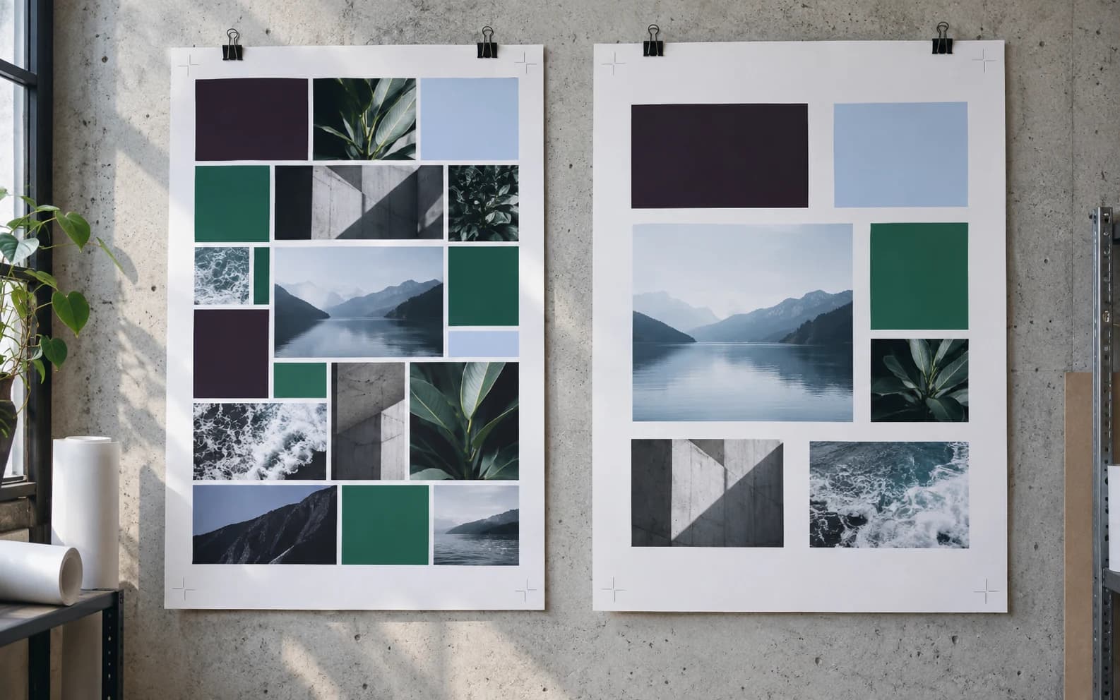
White space separates choices, slows the eye, protects a call to action, makes a photo feel intentional, and gives type enough room to be read. In print, it also protects trim, folds, labels, dielines, and finishing. On mobile, it keeps a button from feeling like a panic response.
Canva's recent design-trend reporting points toward cleaner editorial layouts and less overworked decoration. Adobe's creative trend work keeps returning to sensory texture and human connection. Both signals are useful only if the layout leaves enough room for texture and information to be noticed.
- Reserve quiet zones for logos, labels, buttons, QR codes, and required notes.
- Give bilingual copy its own rhythm instead of shrinking it into the English shape.
- Plan image crops with mobile, social, and print versions in mind.
- Treat margins as production capacity, not decorative emptiness.
Bilingual layouts need real room
English and Korean do not take up space in the same way. A layout that looks generous in English can become cramped when the Korean version needs a different rhythm, line length, or hierarchy. Shrinking type is the fastest way to make the translated version feel like an afterthought.
Good spacing makes localization ordinary. It allows the same message to live in two languages without forcing one to behave like a condensed footnote.
More room can make more information usable
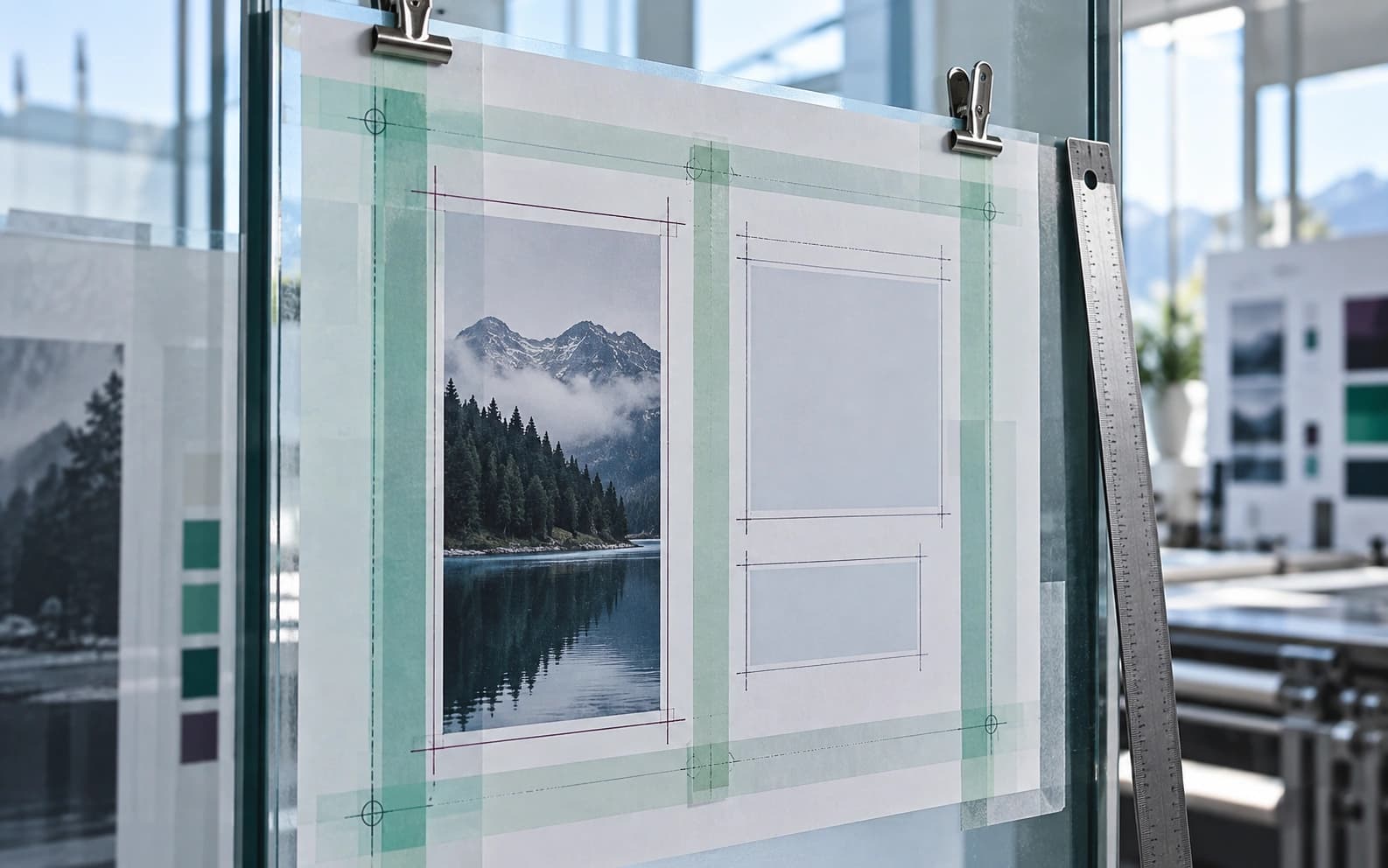
White space does not mean saying less. Sometimes it lets the business say the necessary thing without making the customer work so hard. A service card with five clear items may be more informative than a dense paragraph. A package label with fewer competing blocks may make the important warning, flavor, or reorder cue easier to find.
The question is not whether a layout looks sparse. The question is whether the most important information gets enough space to carry its responsibility.
Spend the space on purpose
A practical audit starts with the pieces that feel strained. Print them or view them on the smallest screen that matters. Cover the logo. Cover the photo. Cover the button. If the page collapses into a gray argument, the spacing is not doing enough work.
White space is not silence. It is the pause that lets the customer hear the offer, the instruction, the image, or the next step. Budget it early, and the layout stops begging for attention long enough to be useful.
Frequently asked questions
Why is white space important in business design?
White space improves legibility, hierarchy, focus, production tolerance, and customer comprehension across websites, print materials, packaging, and social assets.
Does white space mean a design should be minimal?
No. It means the important parts have enough room to work. A detailed layout can still use white space well.
Why does spacing matter for bilingual design?
Different languages have different rhythm, length, and line-break needs. Planned spacing prevents one language version from feeling cramped or secondary.
Need a sharper customer-facing system?
Improve consistency across the brand, website, and sales materials.
Visual Square helps NY/NJ businesses clean up the touchpoints customers actually see first, so the brand feels clearer, more credible, and easier to trust.
Talk through the refresh