
Article · May 28, 2026
What a Dental Practice Needs Before Launch: Logo, Website, Print, and Patient Touchpoints
A launch design guide for dental practices that need to look trustworthy from the first patient interaction.
8 min read
A dental practice launch needs more than a logo. The patient experience should feel clear and credible across web, print, and office materials.
In this article
- 01Design should reduce uncertainty
- 02Build the patient-facing kit
- 03Do not separate web, forms, and office materials
- 04Start with the highest-trust touchpoints
- 05Prepare for launch without overbuilding
Design should reduce uncertainty
New patients are not just looking for a dentist. They are looking for signs that the practice is organized, clear, safe, and easy to deal with. They want to understand what services you offer, how to book, whether insurance or payment information is understandable, and what the first visit will feel like.
That means launch design should reduce uncertainty before a patient ever calls the office. In NY/NJ markets, where patients often compare several offices quickly, a cleaner and more coherent presentation can determine who gets the first appointment request.
Build the patient-facing kit
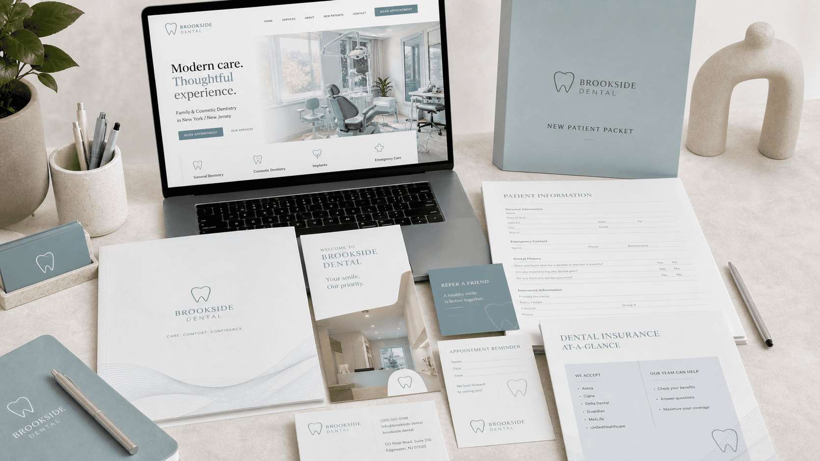
The core launch kit usually includes a logo, website, service pages, new patient packet, referral card, insurance information sheet, appointment graphics, Google Business Profile visuals, and any printed items patients receive at check-in or after treatment.
What matters is not the quantity of assets. What matters is whether those assets answer recurring patient questions in a calm, readable, and consistent way. A modern dental brand often wins by being easier to understand, not by trying to look trendy.
- Homepage and service page structure that explains treatments clearly
- New patient forms and information sheets that feel organized, not generic
- Referral cards, post-treatment instructions, and reminder visuals that match the same system
- Google profile, website, and printed pieces that all support the same trust signal
Do not separate web, forms, and office materials
One of the most common mistakes is building the site first, patient forms later, and printed materials only when the opening date gets close. That creates a fragmented experience where the website feels new, the forms feel outdated, and the office materials feel improvised.
A small but well-defined design system prevents that problem. Typography, spacing, icon use, color hierarchy, and information layout should carry across the website, handouts, reminder graphics, and consultation materials.
Start with the highest-trust touchpoints
If the project has to be phased, start with the assets that affect first impressions and patient action most directly. Usually that means the homepage, service pages, contact or booking flow, new patient packet, and the key forms or handouts the office gives out every day.
Once those pieces are aligned, the rest of the launch becomes easier. Referral cards, interior communication, review-request graphics, and seasonal campaign materials can then be built from the same visual language instead of becoming separate mini-projects.
Prepare for launch without overbuilding
A new practice does not need a giant hospital-style brand manual to open well. It needs a focused launch system that covers what patients actually see and use. That includes responsive website layouts, readable type, consistent forms, production-ready print files, and a small set of reusable templates for future updates.
That level of preparation helps the office look credible from day one while still leaving room to evolve as patient questions, service mix, and operational needs become clearer after opening.
Frequently asked questions
Does a dental office need custom branding?
Yes, especially when it is new or competing locally. Custom branding helps the practice feel credible and memorable.
What is the most important website section?
Clear service and booking information usually matters most because it helps patients take the next step.
Should patient forms be redesigned too?
Usually yes. Forms, handouts, and patient packets are part of the brand experience, and outdated documents can weaken trust even if the website looks polished.
Can a practice phase the project instead of doing everything at once?
Yes. Many practices start with the website, patient packet, and core print materials first, then expand into referral tools, office communication, and seasonal campaign assets.
Need a sharper customer-facing system?
Improve consistency across the brand, website, and sales materials.
Visual Square helps NY/NJ businesses clean up the touchpoints customers actually see first, so the brand feels clearer, more credible, and easier to trust.
Talk through the refresh