
Article · Oct 20, 2026
Type Has to Work at Distance
Typography for signs, windows, cards, and pages should be judged in the places customers actually read it.
8 min read
Good typography is not only a file decision. It has to survive distance, glare, motion, material, and the customer's partial attention.
In this article
- 01The type looks different from across the room
- 02Legibility is a business condition, not a mood
- 03Materials change the voice of the letter
- 04Start with the hardest reading moment
The type looks different from across the room
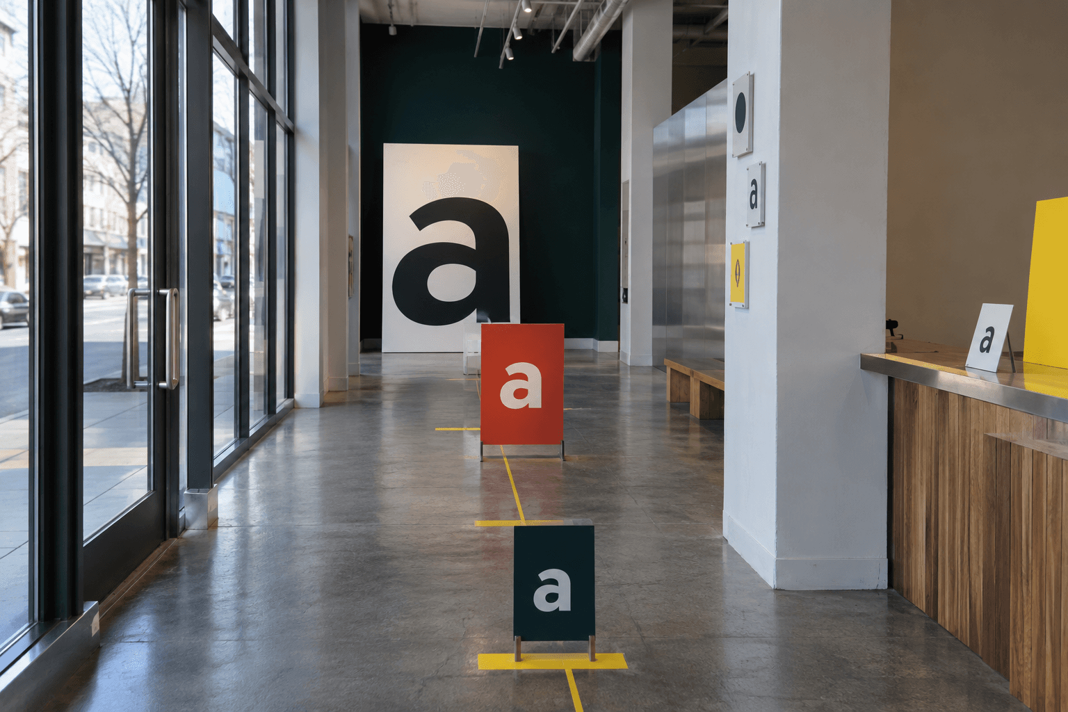
A type choice can look elegant on a screen and become vague ten feet away. The thin stroke that felt refined in a PDF softens behind glass. The small label that looked disciplined on a mockup disappears under warm bulbs. The storefront card that seemed minimal asks a walking customer to slow down and solve it.
Customers rarely describe this as typography. They say the place was hard to find, the menu was hard to read, the offer was unclear, or the business felt unfinished. Type carries that judgment quietly. It is one of the places where brand taste meets physics.
Legibility is a business condition, not a mood
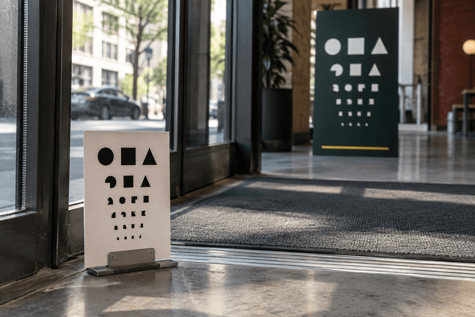
Accessibility guidance such as WCAG contrast rules gives digital teams a useful baseline, but real-world type has additional pressure. Glass reflects traffic. Paper changes under lighting. Vinyl edges thicken or soften. A sign is read while someone is moving. A service card is read while someone is deciding whether to ask a question.
This does not mean every brand should become blunt. It means refinement has to be tested. A beautiful type system that fails at distance is not refined in use. It is asking the customer to do extra work.
- Test key type at the actual size, material, and lighting condition whenever possible.
- Use hierarchy to separate name, category, offer, instruction, and next step.
- Check small labels on phones, printed cards, windows, menus, and profile thumbnails.
- Let contrast and spacing support the brand tone instead of fighting it.
Materials change the voice of the letter
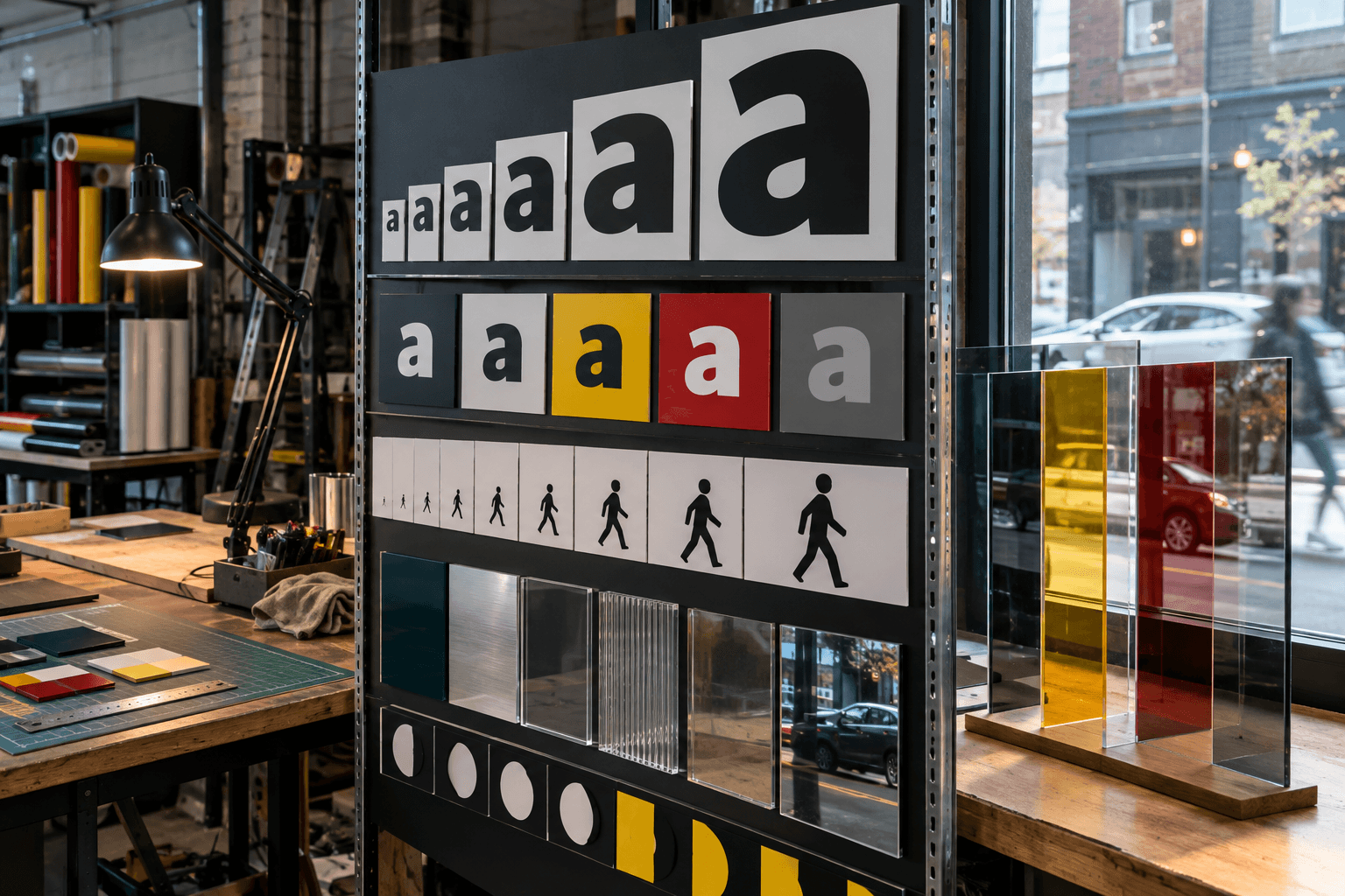
The same word does not feel the same in cut vinyl, painted metal, acrylic, uncoated paper, email, and a mobile hero. Material gives type a voice. It can make the business feel established, temporary, quiet, clinical, warm, premium, practical, or confused.
That is why typography should not be approved only as a font name. The system needs scale rules, production notes, contrast pairings, line-length limits, crop behavior, and fallback choices. Those decisions connect brand identity to the actual surfaces where customers read.
Start with the hardest reading moment
A useful audit starts with the most pressured surface. For a storefront, that may be the door, window, or sidewalk angle. For a restaurant, it may be the menu board. For a service business, it may be the mobile page and confirmation email.
Once that moment works, the system can become more expressive elsewhere. The brand does not lose personality because the letters can be read. It earns the right to be noticed without making the customer squint.
Frequently asked questions
How should a business test typography before production?
Print or mock up key type at actual size, view it from the customer's distance, check lighting and glare, and test digital versions on mobile and thumbnails.
Does readable typography make a brand less distinctive?
No. Strong hierarchy, spacing, material choices, and scale can make type both distinctive and easier to use.
What typography rules should a brand system include?
Include type scale, contrast pairings, spacing, line length, signage sizes, print notes, web rules, social crop behavior, and production file guidance.
Need a sharper customer-facing system?
Improve consistency across the brand, website, and sales materials.
Visual Square helps NY/NJ businesses clean up the touchpoints customers actually see first, so the brand feels clearer, more credible, and easier to trust.
Talk through the refresh