
Article · Sep 8, 2026
Small Type Carries the Brand
Why fine print, labels, footer links, captions, care cards, and package inserts deserve the same design attention as the larger brand moments.
8 min read
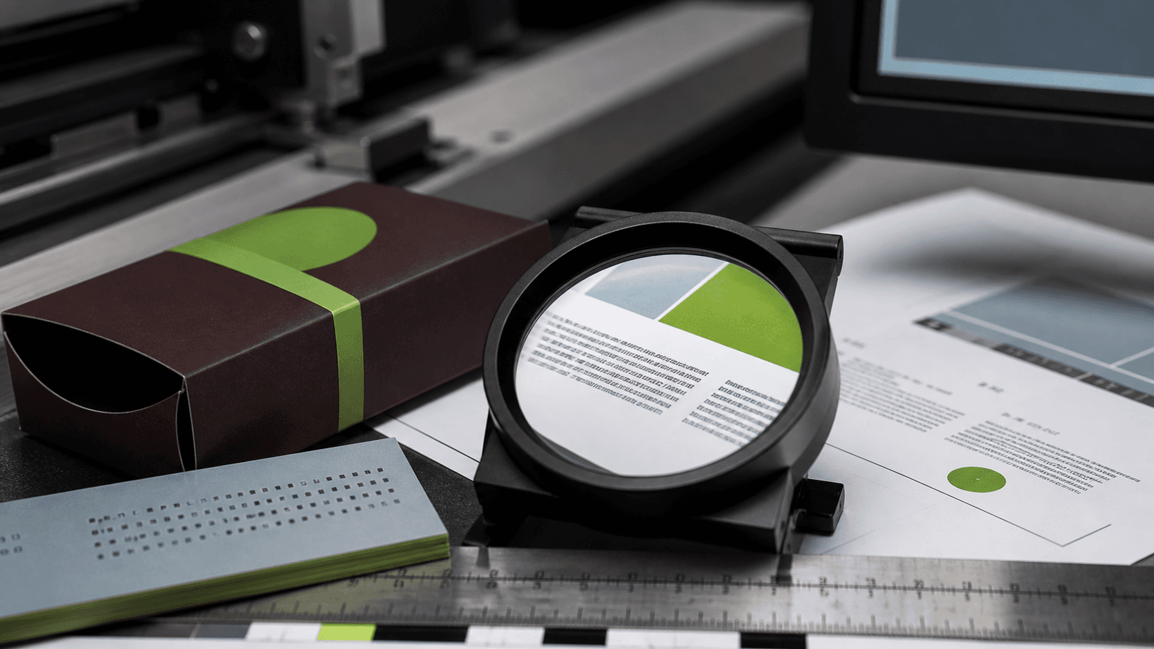
Small type is where brand reliability is often tested. Fine print, labels, footer links, captions, care cards, and package inserts carry practical information, so they need hierarchy, contrast, spacing, and production checks rather than leftover styling.
In this article
- 01The smallest text often has the most work
- 02Legibility is a form of service
- 03Tiny does not mean secondary
- 04Bilingual details need their own room
- 05Audit the edges of the system
The smallest text often has the most work
The large headline gets the meeting. The small type gets the customer home. It explains how to care for the product, where to park, what to bring, how to cancel, what the package contains, which QR code matters, and which link is the real next step.
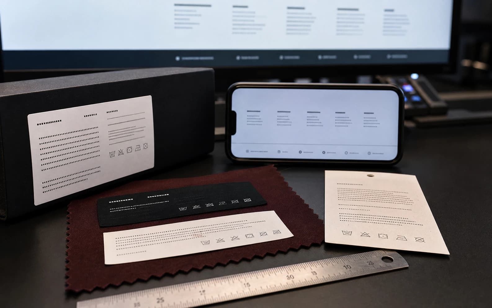
Because it is small, it is often designed last. The footer inherits a size. The label borrows a type style. The card receives whatever space remains after the logo and color have had their turn. Then the customer tries to read it under a counter light, through a phone camera, on a receipt, or while standing beside a car.
Legibility is a form of service
A business can sound careful in the main copy and still feel careless in the details. If the care card is too faint, the return instruction too cramped, or the footer link too low-contrast to use, the customer has to work harder than the brand intended.
W3C's WCAG contrast guidance is usually discussed as an accessibility standard, and it is. It is also a useful business floor. Important text should not depend on perfect eyesight, perfect light, or a freshly cleaned screen. The more practical the information, the less it should be treated as decoration.
- Check contrast for labels, captions, disclaimers, footer links, and printed instructions.
- Test small type on the actual paper, label stock, packaging, or screen where it will live.
- Avoid long line lengths and tight leading when customers may read quickly.
- Create separate Korean layouts when translation changes rhythm and length.
Tiny does not mean secondary
Small type is rarely glamorous, but it often carries the rules of the relationship. A package insert may explain use and care. A website footer may carry location, policy, and contact structure. A service card may tell the customer what happens next. A menu note may protect clarity around ingredients or ordering.
When those details are treated as leftovers, the brand begins to fray at the edges. Customers may not name the typography problem. They simply feel that the business is harder to use than it should be.
Bilingual details need their own room
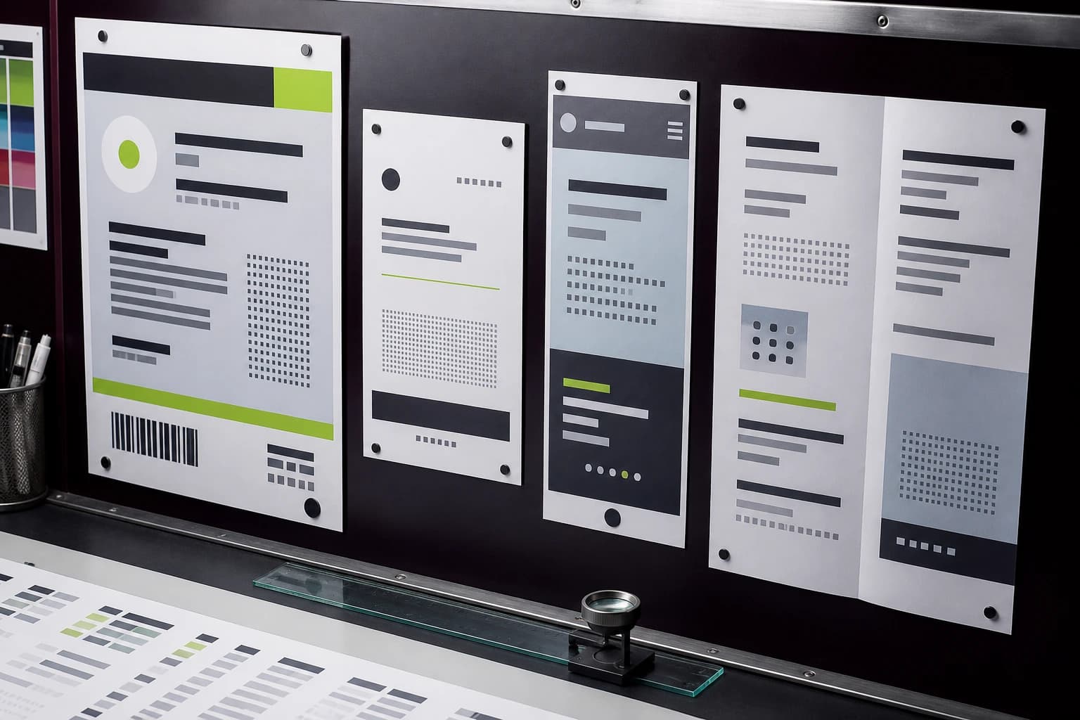
NY/NJ businesses that serve English- and Korean-speaking customers often discover the small-type problem faster. A phrase that fits neatly in English may need a different rhythm in Korean. A label that feels balanced in one language can become crowded, formal, or oddly broken in another.
The answer is not to shrink everything until it fits. Bilingual design needs hierarchy decisions: what must appear in both languages, what can be separated by format, where line breaks should change, and which touchpoints deserve a full transcreation rather than a cramped translation. Small type is where localization becomes production, not only language.
Audit the edges of the system
The practical audit is to collect the least celebrated text in the business: footer links, labels, disclaimers, card backs, captions, receipt notes, package inserts, QR instructions, and tiny service explanations. Print them. Photograph them. Read them on a phone. Ask whether the customer can use them without squinting or guessing.
The brand may not need more drama. It may need the quiet parts to hold. When the smallest text becomes readable, organized, and properly produced, the larger identity starts to feel less like a surface and more like a business keeping its word.
Frequently asked questions
Why does small type matter in brand design?
Small type often carries practical information such as instructions, policies, captions, labels, prices, and next steps. If it is hard to read, the brand feels harder to use.
How should small type be tested before production?
Test it on the actual screen, paper, label stock, package, sign material, or card where it will appear, and review contrast, line length, spacing, and lighting conditions.
What changes when small type is bilingual?
Translated text may change length, rhythm, and hierarchy. English and Korean versions often need adjusted line breaks, spacing, and sometimes separate layouts.
Need a sharper customer-facing system?
Improve consistency across the brand, website, and sales materials.
Visual Square helps NY/NJ businesses clean up the touchpoints customers actually see first, so the brand feels clearer, more credible, and easier to trust.
Talk through the refresh