

Article · Aug 18, 2026
The Sign Has to Work Before It Becomes Beautiful
Why storefront signage should be judged first by distance, direction, hierarchy, and production reality before style makes its entrance.
8 min read
A storefront sign is not only a brand expression. It is a small navigation system that has to be recognized from the sidewalk, the parking lot, the doorway, and the customer's first hesitation.
In this article
- 01A sign is a promise made at walking speed
- 02The logo is only one stop in the approach
- 03Materials change the tone of the message
- 04A small exterior system beats one heroic sign
- 05Beauty arrives after the route is clear
A sign is a promise made at walking speed
A storefront sign often gets reviewed while everyone is standing still. The file is open, the mockup is centered, and the business name looks pleasing on a clean rectangle. Then the sign goes outside, where it has to compete with tree shadows, parked cars, reflections, neighboring awnings, delivery trucks, and a customer who is trying not to miss the door.
That is the first useful test. Before a sign becomes beautiful, it has to work at walking speed. It has to say, quietly and quickly, this is the place, this is the entrance, and this business is organized enough to trust with the next small decision.
The logo is only one stop in the approach
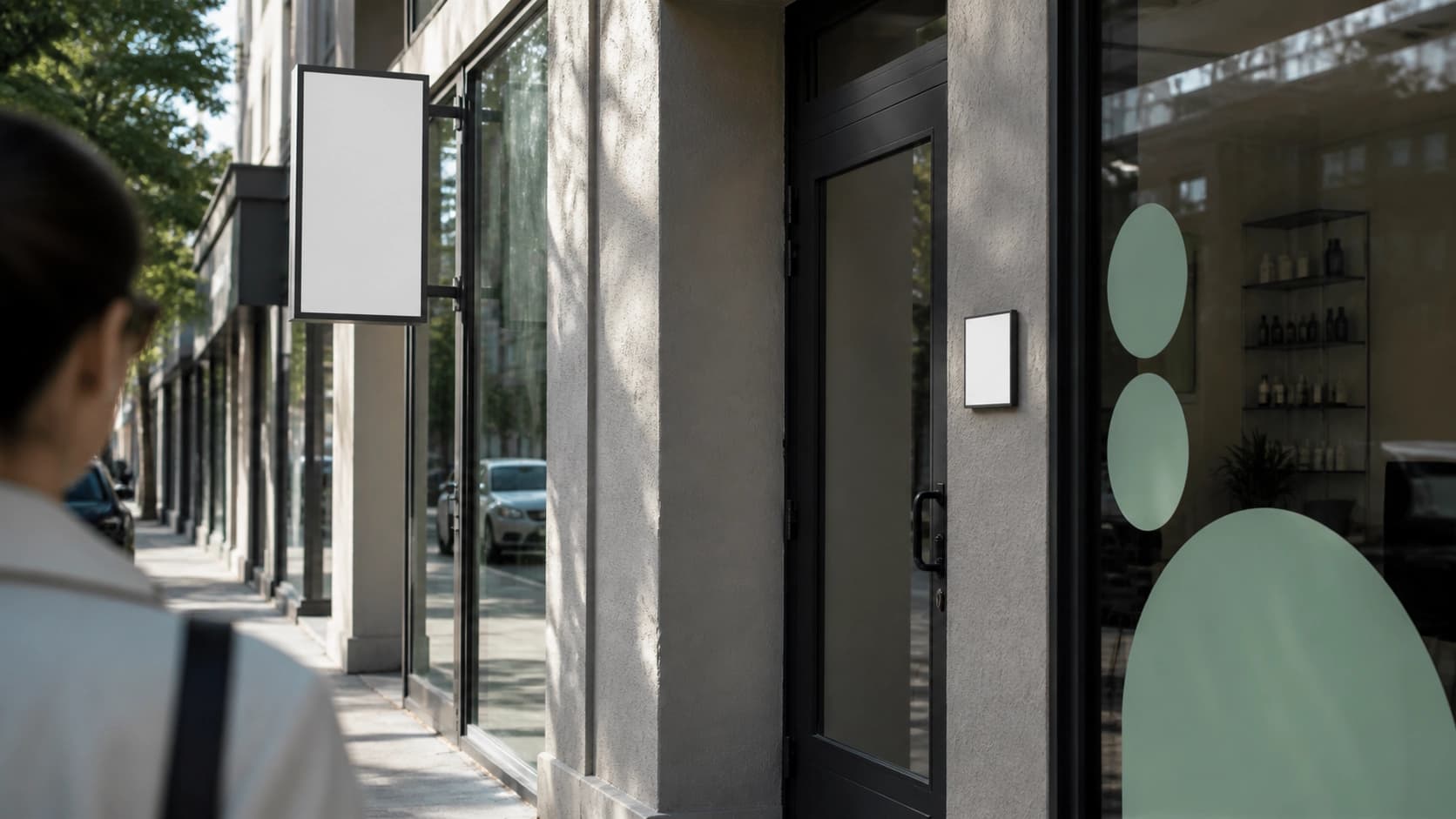
A customer rarely meets the exterior as one perfect composition. They see a projecting sign from half a block away, then a window mark, then a door plaque, then hours, then a small directional cue inside. If those pieces use different scales, tones, or levels of clarity, the brand can feel oddly uncertain even when the logo is well drawn.
The practical question is not whether every sign looks the same. It is whether each sign knows its job. The blade sign identifies. The window decal filters the view and adds recognition. The door plaque confirms. The hours and entry cues answer the last tiny questions. Together they create confidence before anyone has spoken.
- Review signage from the actual sidewalk, not only from a centered mockup.
- Assign a job to each surface before choosing finishes.
- Check visibility in morning light, evening reflection, and bad weather.
- Keep the door confirmation clearer than the decorative moment.
Materials change the tone of the message
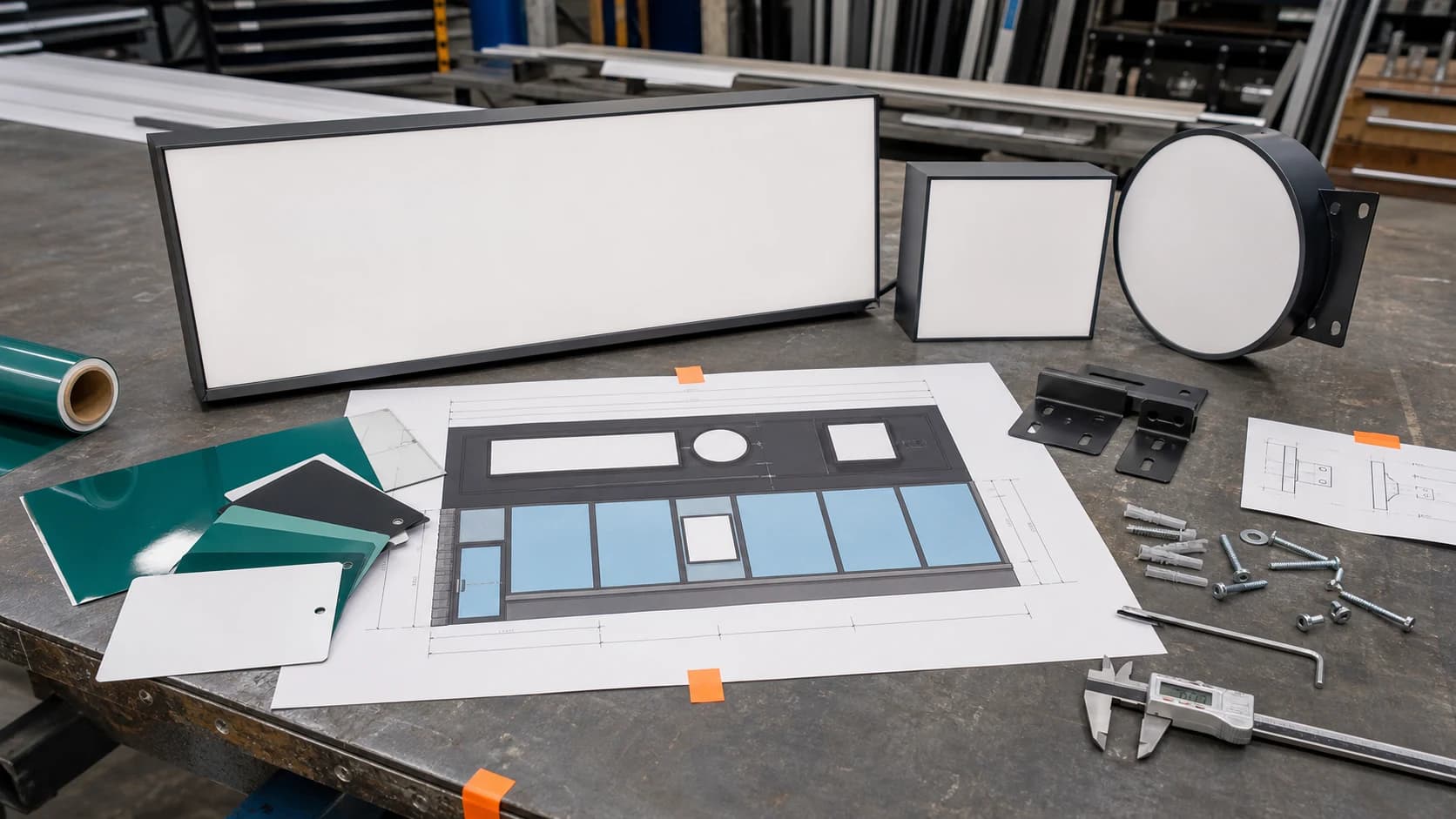
The same identity can feel different in vinyl, acrylic, painted metal, etched glass, illuminated letters, or a temporary banner. Material is not a neutral carrier. It changes whether the business feels permanent, careful, improvised, or expensive in the right way.
That is why production decisions belong inside brand strategy. Mounting hardware, edge thickness, vinyl opacity, glare, municipal limits, landlord rules, and vendor tolerances all shape the final impression. The customer will not name those details. They will simply feel whether the business looks settled or still finding itself.
A small exterior system beats one heroic sign
Many small businesses put too much pressure on the main sign. It has to announce the name, explain the category, look distinctive, fit the building, satisfy the landlord, and rescue every other unclear touchpoint. A single sign cannot carry all that without becoming crowded.
A stronger approach is a small exterior system. Use one clear name mark, one category cue where needed, one window rhythm, one door confirmation, and one practical rule for temporary updates. Google Business Profile guidance also treats photos, services, and business details as part of how customers understand a place; the physical exterior should make those digital cues feel true when the customer arrives.
Beauty arrives after the route is clear
None of this argues for dull signage. It argues for sequence. First distance, then direction, then confirmation, then tone. Once the route is clear, beauty has somewhere useful to live.
The best storefront signs do not beg for admiration. They reduce hesitation. They make the entrance feel obvious, the business feel present, and the brand feel like it belongs to the block. The sign can still be elegant. It simply earns that elegance by helping someone find the door.
Frequently asked questions
What should a business check before approving storefront signage?
Check the sign from real customer distances, viewing angles, light conditions, reflections, door approach, material samples, landlord rules, and production specifications.
How does signage affect brand strategy?
Signage turns the identity into a physical navigation system. Scale, material, hierarchy, and placement shape whether the business feels clear and established.
Does every storefront sign need to match exactly?
No. Each surface should share a coherent visual logic, but blade signs, windows, door plaques, and temporary notices have different jobs.
Need a sharper customer-facing system?
Improve consistency across the brand, website, and sales materials.
Visual Square helps NY/NJ businesses clean up the touchpoints customers actually see first, so the brand feels clearer, more credible, and easier to trust.
Talk through the refresh