
Article · Oct 2, 2026
Service Pages Need a Route
A service page should guide customers from their problem to the next appointment, not scatter answers across a polished scroll.
7 min read
Local service websites work better when the page behaves like a route: problem, fit, proof, timing, appointment, and follow-up. The design should make the path visible before asking for the click.
In this article
- 01A polished page can still leave people wandering
- 02Start with the hesitation
- 03The path should be visible
- 04Design the follow-up before the button
A polished page can still leave people wandering
A customer lands on a service page with a simple private question: is this for me, and what happens if I raise my hand? Many pages answer with a handsome hero, a confident paragraph, several cards, a testimonial module, and a button that appears every few inches. The page looks active, but the customer still has to assemble the route.
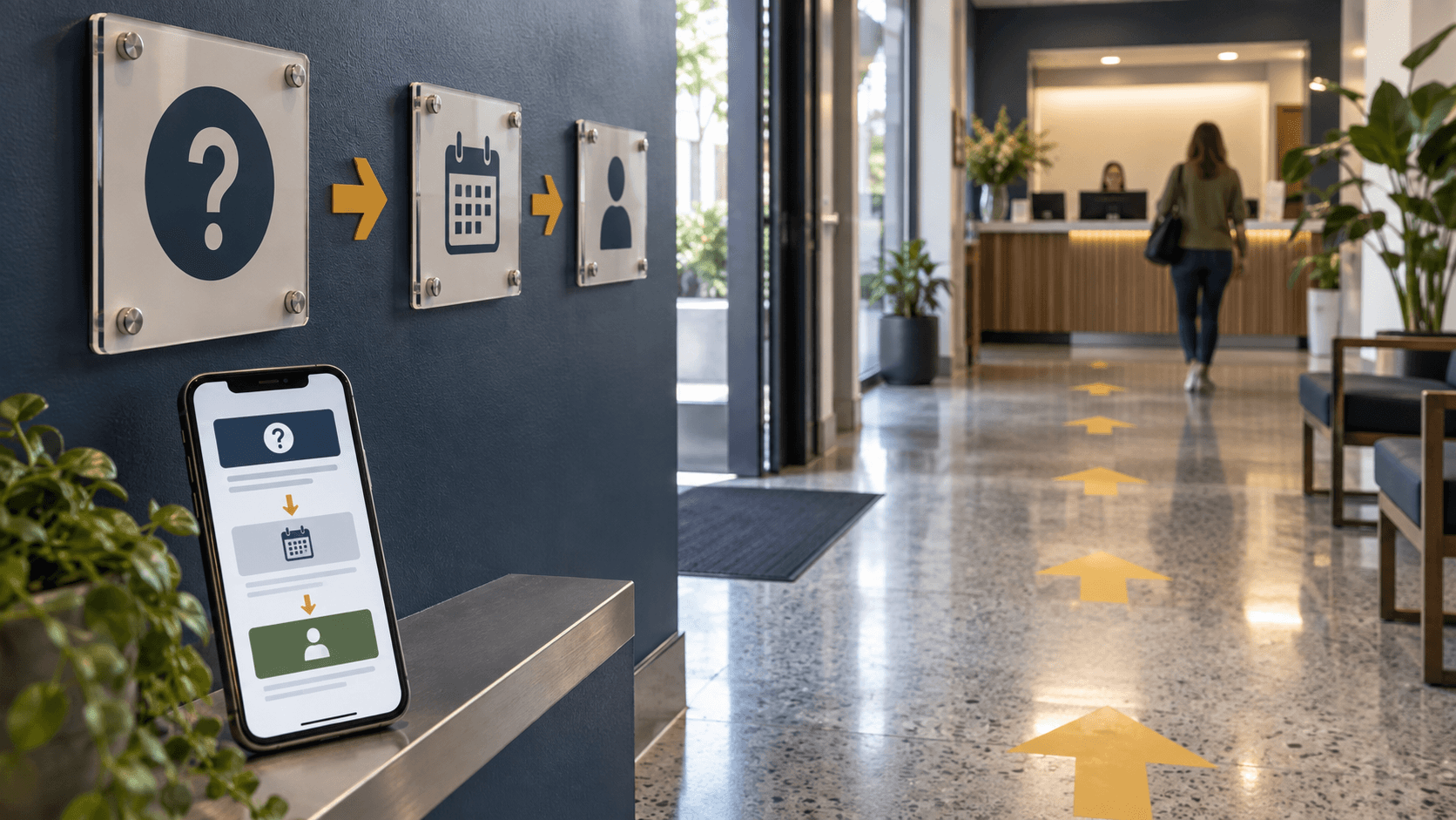
Good service-page design works more like a lobby with clear signs. It does not make the visitor admire the signage. It lets them understand where they are, what choice comes next, and how much commitment the next step requires.
Start with the hesitation
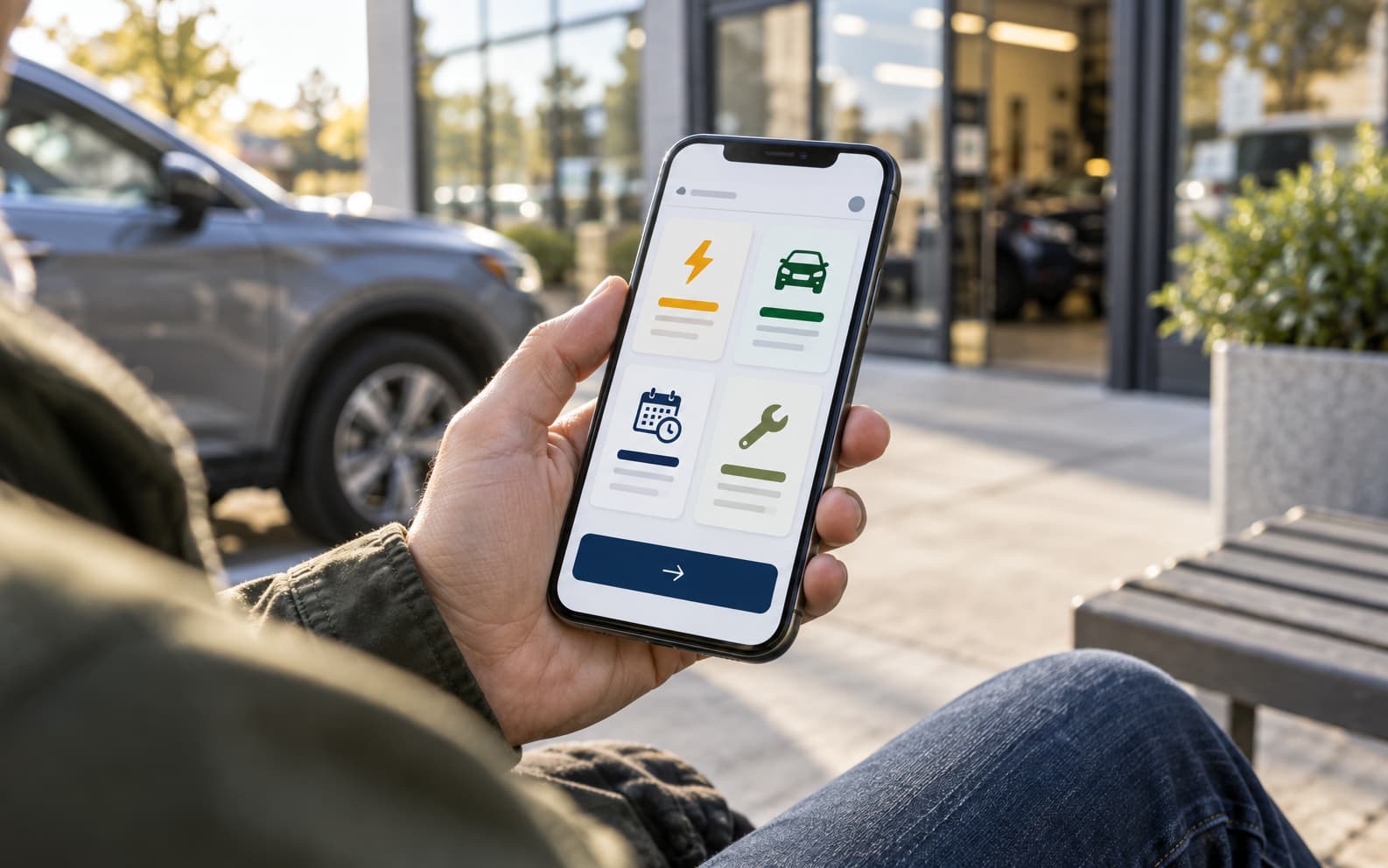
The best route begins with the customer's hesitation, not the business's full resume. A dental patient may wonder what the first visit includes. A professional-services buyer may wonder whether the project is too small or too early. A med spa customer may want to know what consultation comes before treatment. A property owner may need to understand timing before price.
Those questions should shape the order of the page. The opening clarifies the problem. The next section defines fit. Then come process, proof, timing, and next step. This does not need to be rigid, but it should feel intentional enough that the customer can stop guessing.
- Name the customer situation before describing the service in full.
- Separate service fit from process, proof, pricing cues, and booking cues.
- Use headings that answer real concerns instead of labeling generic sections.
- Place the main action after enough context, then repeat it only where the route earns it.
The path should be visible
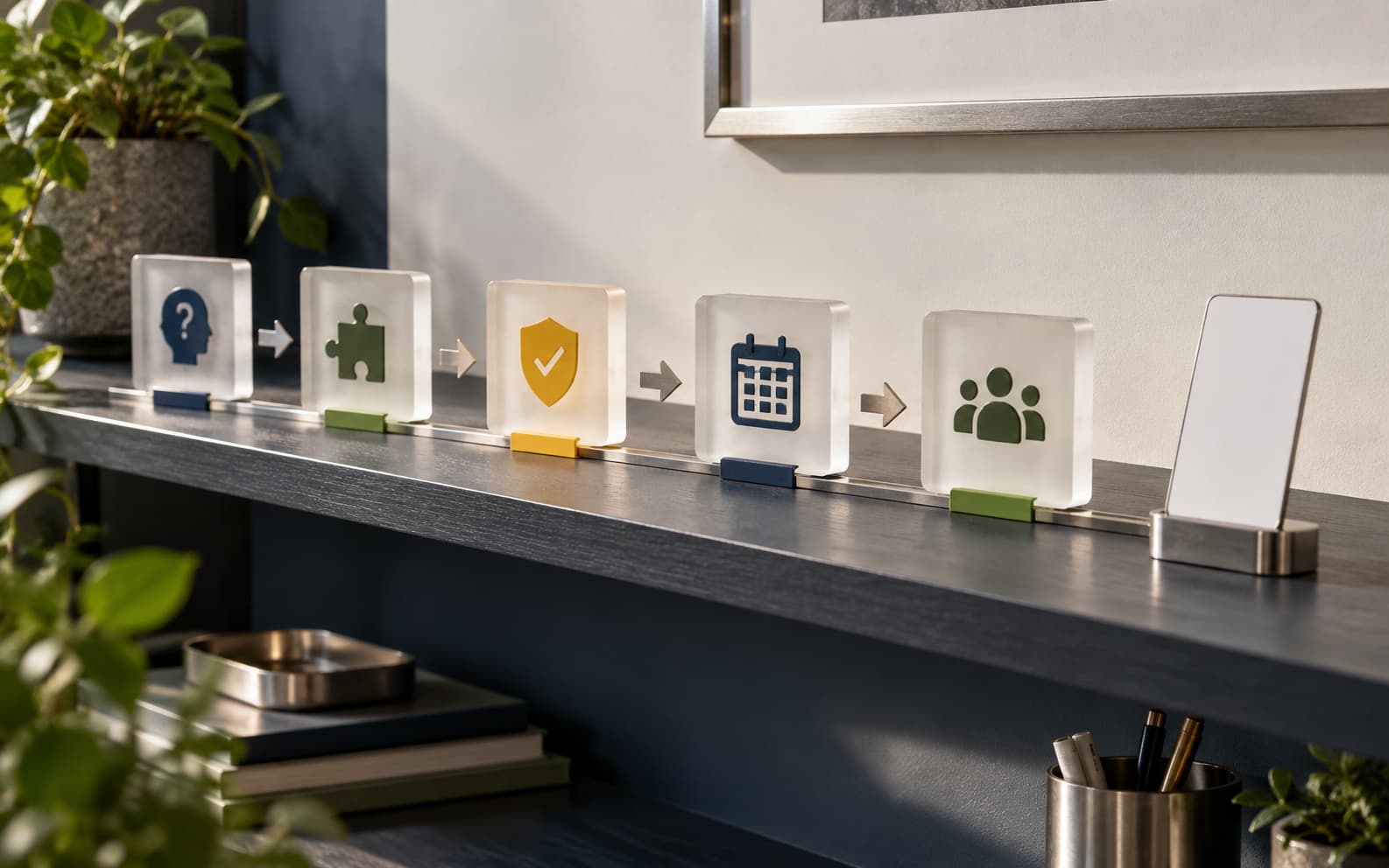
A service route can be visual without becoming a gimmick. Icons, steps, cards, and small diagrams work when they reduce effort. They fail when they decorate a page that is still out of order. The customer should be able to skim the page and understand the sequence: problem, service fit, proof, appointment, follow-up.
Google's helpful-content guidance keeps returning to the same plain idea: make content for people and make it genuinely useful. Structured data can help search systems understand a page, but it does not replace the visible work of explaining the service clearly. The page itself has to carry the answer.
Design the follow-up before the button
A route does not end at the call to action. The customer wants to know what happens after submitting the form, booking the consultation, or requesting the estimate. If the page promises clarity and the confirmation email becomes vague, the route breaks at the most sensitive moment.
A practical audit is simple. Imagine someone standing in a lobby, unsure where to go. Would the page tell them where they are, who the service is for, what proof matters, what happens next, and how to ask a question without feeling trapped?
Frequently asked questions
What should a local service page include?
A strong service page should include the customer problem, service fit, process, proof, timing or preparation cues, FAQs, and a clear next step.
How does page structure affect conversions?
Clear structure reduces uncertainty. Customers are more likely to continue when they understand whether the service fits, what happens next, and what commitment the action requires.
Does structured data replace clear page content?
No. Structured data can help systems understand content, but the visible page still needs clear, useful information for people.
Need a sharper customer-facing system?
Improve consistency across the brand, website, and sales materials.
Visual Square helps NY/NJ businesses clean up the touchpoints customers actually see first, so the brand feels clearer, more credible, and easier to trust.
Talk through the refresh