

Article · Aug 27, 2026
A Service Page Should Act Like a Front Desk
Why local service pages need to greet, orient, qualify, and hand off the next step before asking customers to commit.
8 min read
A service page is not just a place to describe an offering. For a local business, it often has to do the work of a calm front desk: greet the visitor, answer the immediate questions, explain the handoff, and make the next step feel specific.
In this article
- 01The page is the first person at the counter
- 02Orientation comes before persuasion
- 03The handoff is part of the design
- 04Specificity is not the same as saying more
- 05Audit the page like a customer is standing there
The page is the first person at the counter
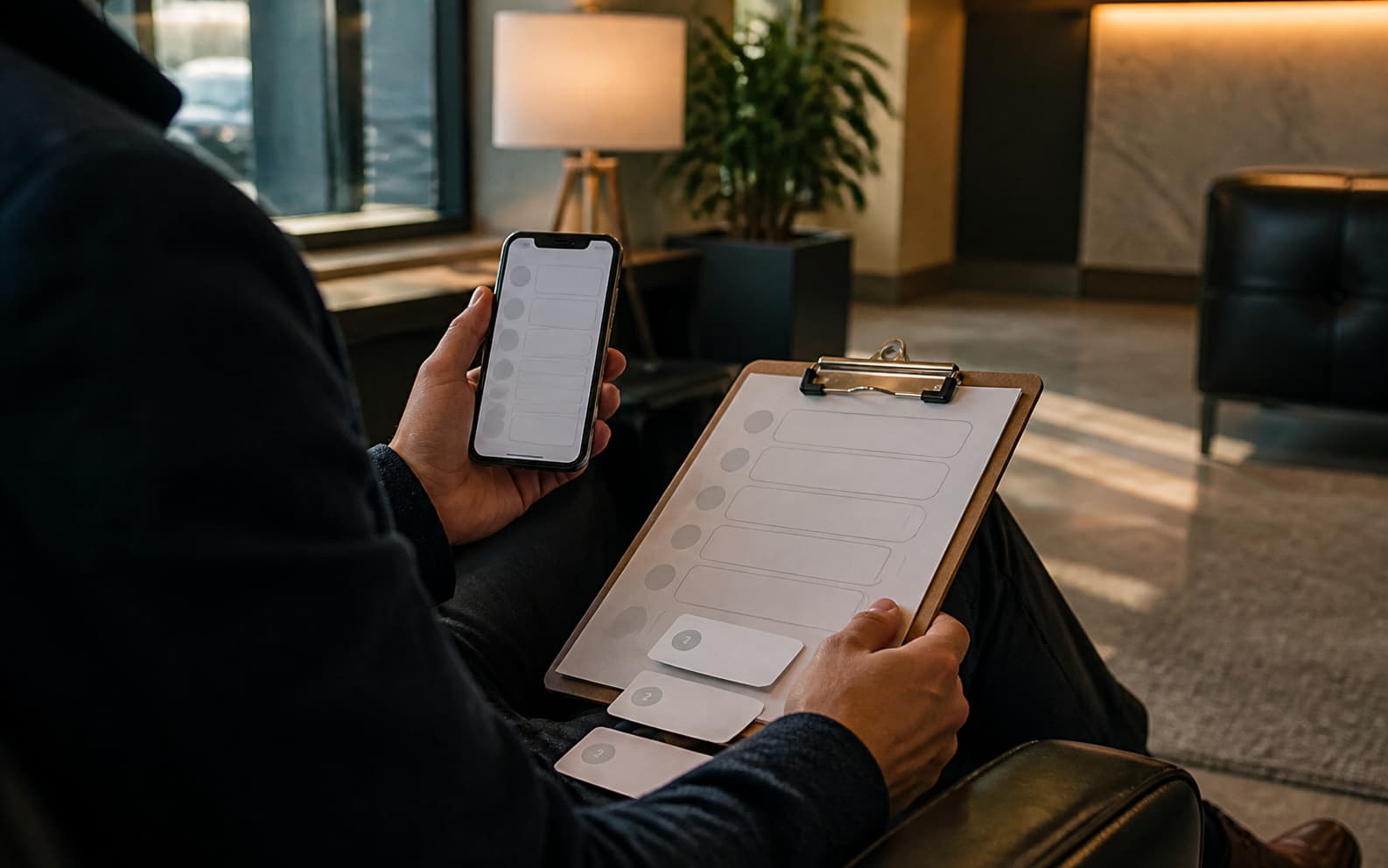
A customer can arrive at a service page after dinner, between errands, or from a search result opened in a parked car. No one is there to read their expression. No receptionist can hear the hesitation in the question. The page has to notice on behalf of the business.
Many service pages fail because they behave like brochures. They describe the company, list the offering, and brighten the button. A better page behaves like a good front desk. It says where the visitor is, what the service covers, who it is right for, what happens next, and what the business needs before the conversation can become useful.
Orientation comes before persuasion
Local service marketing often tries to persuade before the visitor is oriented. The copy says the team is experienced, responsive, trusted, and tailored. Those words may be sincere, but they do not answer the visitor's first practical questions. Is this the service I need? Is it for my kind of business or situation? What will happen if I reach out?
Google's people-first search guidance is useful here because it rewards the same discipline a customer wants: clear, useful information created for real people. The page should not stuff answers into a decorative FAQ at the bottom. It should place the basic orientation near the decision point, where uncertainty is most expensive.
- Name the service in the same words a customer would use when asking for it.
- Explain what is included and what is not included without sounding defensive.
- Show the next step before the visitor has to press the button.
- Connect the page to the email, intake form, and staff handoff that follow.
The handoff is part of the design
A front desk does not only welcome. It routes. It asks for the right information, explains timing, prevents duplicate work, and protects the tone of the business before the service begins. A service page can do a quieter version of that job.
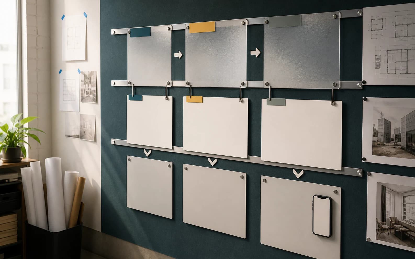
That means the page should be designed with the operating pieces beside it. The inquiry form, confirmation page, automatic email, intake document, proposal cover, and first call notes should use the same sequence. If the page promises a careful process but the next message sounds like a generic inbox receipt, the brand loses some of its composure in the handoff.
Specificity is not the same as saying more
The answer is not a longer page. A long page can still be evasive. The useful move is sharper specificity: a short explanation of fit, a plain-language process, a realistic response expectation, a few useful examples, and a clear next action.
This is especially important for professional services, wellness businesses, studios, clinics, brokers, and B2B local teams where the first decision is rarely a purchase. The visitor is deciding whether the business is organized enough to deserve a conversation. The page should make that decision easier without pretending to guarantee the outcome.
Audit the page like a customer is standing there
The practical test is simple. Open the service page on a phone and read only what appears before the first major scroll. Then ask what a good front desk would have answered by now. Where am I? Is this for me? What should I do? What happens after I do it?
A service page that can answer those questions does not need to shout. It only needs to receive the visitor with enough clarity that the next human interaction starts ahead of confusion rather than behind it.
Frequently asked questions
What should a local service page answer first?
It should quickly explain what the service is, who it is for, what is included, what happens after inquiry, and how the customer should prepare.
How is service-page design connected to customer experience?
The page sets expectations before the first human conversation. Its structure should connect to forms, confirmation pages, emails, and staff handoffs.
Does a service page need to be long to be useful?
No. Useful pages are specific, not merely long. They answer real decision questions in the right order and avoid vague claims.
Need a sharper customer-facing system?
Improve consistency across the brand, website, and sales materials.
Visual Square helps NY/NJ businesses clean up the touchpoints customers actually see first, so the brand feels clearer, more credible, and easier to trust.
Talk through the refresh