
Article · Aug 13, 2026
Make the Offer Recognizable Before the Click
How local business websites can make service offers easier to recognize across mobile pages, storefront cues, email, print, and profile updates.
8 min read
Local marketing works better when the offer is recognizable before the customer has to hunt. The same promise, next step, and visual hierarchy should travel from mobile pages to storefront cues, email, print, and profiles.
In this article
- 01The customer should not have to translate the business
- 02Recognition beats persuasion at the first step
- 03The offer has to survive different surfaces
- 04Specificity is calmer than a louder button
- 05Audit the first thirty seconds
The customer should not have to translate the business
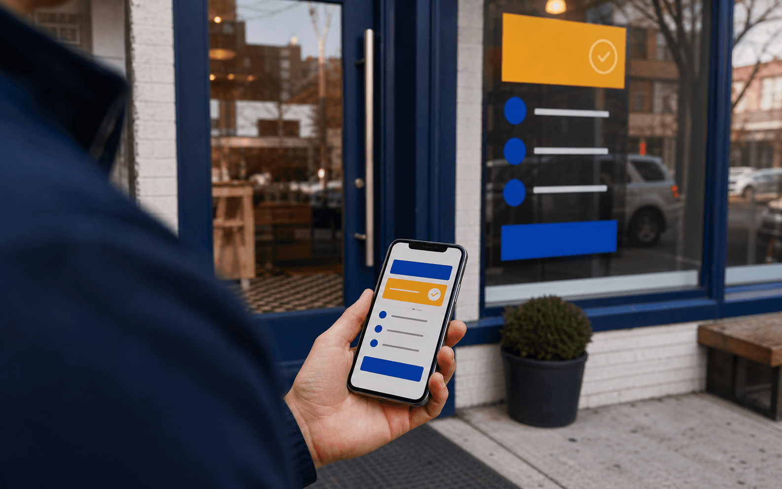
A person standing outside a local business with a phone in hand is doing a small act of translation. The website says one thing, the window says another, the Google profile shows a third, and the printed card at the counter may use a fourth version of the offer.
None of those pieces may be wrong. The problem is that the customer has to assemble them. A good offer system removes that work. It lets the person recognize what is being offered, who it is for, and what the next step is before they begin hunting through the page.
Recognition beats persuasion at the first step
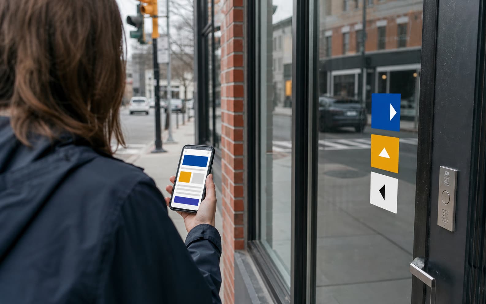
Many local websites try to persuade before they have made the offer legible. The hero line is polished, the button is bright, and the service list is generous, but the visitor still has to ask: Is this for me? Is it local? Is it an appointment, a quote, a class, a consultation, a pickup order, or a membership?
Google's own search guidance keeps returning to helpful, reliable, people-first content. In local marketing, that does not require grand language. It requires concrete labels, useful summaries, visible next steps, current business information, and pages that answer the question a real customer brought with them.
- Name the service or offer in the customer's language before adding brand language.
- Place the next step near the first moment of clarity, not only at the bottom.
- Keep profile, website, email, and printed descriptions aligned.
- Use visuals that help the customer identify the service, location, or process.
The offer has to survive different surfaces
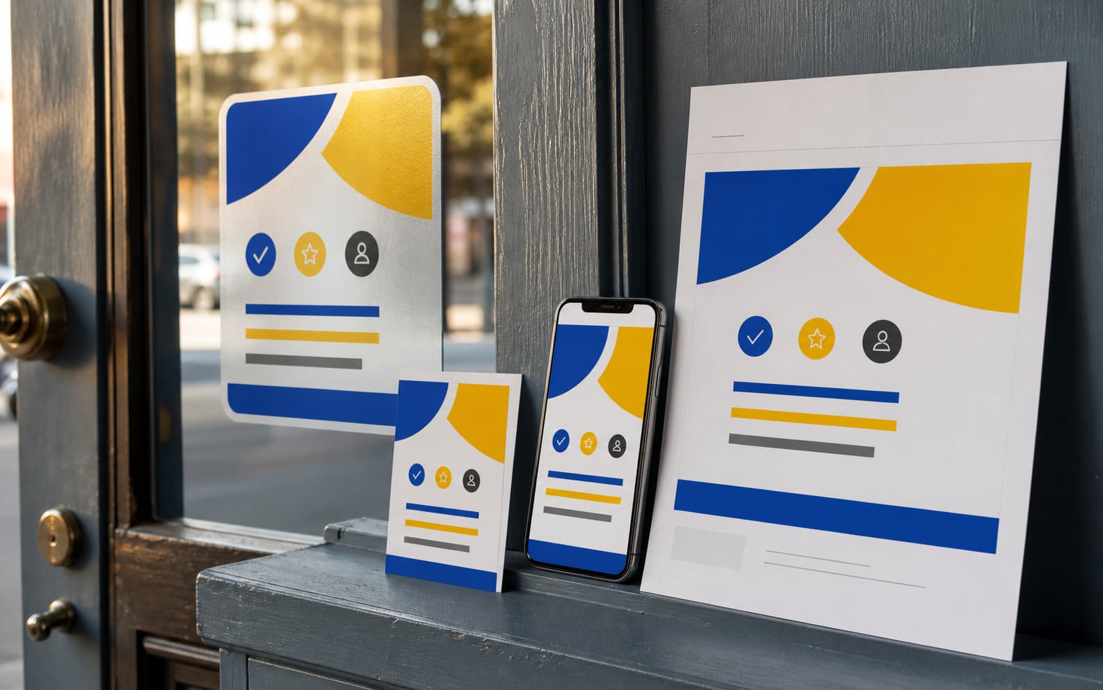
A campaign may begin on a website, but it rarely stays there. A med spa offer becomes a booking page, Instagram cover, Google update, gift card, service menu insert, and reminder email. A professional service consultation becomes a landing page, PDF, LinkedIn document, email header, and one-page handout.
If each surface is designed from scratch, the offer drifts. The fix is not to make every piece identical. The fix is to build a small offer kit: one short promise, one specific audience, one next step, one image rule, one proof or context block, and a few production crops sized for the channels that actually matter.
Specificity is calmer than a louder button
The usual response to a weak offer is to make the call to action bigger. That can help when the page already makes sense. When the offer is vague, a louder button only makes the uncertainty brighter.
A calmer fix is specificity. Say what the appointment includes. Say who the service is for. Say what happens after a form is submitted. Say whether the business serves New York, New Jersey, a neighborhood, or a service area. The page does not need to shout when the next step feels ordinary and clear.
Audit the first thirty seconds
A practical refresh can begin with a thirty-second audit. Open the homepage on a phone. Look at the Google Business Profile. Scan the most important service page. Check the latest email or printed card. Ask whether the same offer can be recognized without explanation.
The best local marketing often feels less like a campaign and more like a business finally speaking in one voice. The customer at the door should not need to decode the website. The website should make the door easier to open.
Frequently asked questions
What is a recognizable offer for a local business?
It is a service or promotion that a customer can quickly understand across the website, profile, email, print, and physical business cues.
Why do local offers become confusing?
They often drift because each channel is updated separately, using different labels, visuals, calls to action, and levels of detail.
What should be in a local offer kit?
Include a short promise, target audience, next step, image rule, supporting proof or context, channel crops, and reusable web, social, email, and print versions.
Need a sharper customer-facing system?
Improve consistency across the brand, website, and sales materials.
Visual Square helps NY/NJ businesses clean up the touchpoints customers actually see first, so the brand feels clearer, more credible, and easier to trust.
Talk through the refresh