
Article · Jun 9, 2026
Med Spa Website Design Mistakes That Make a Brand Look Less Premium
Common website and brand presentation mistakes that make med spas look less credible or less premium.
8 min read
A med spa website should build trust quickly, explain treatments clearly, and make booking feel easy.
In this article
- 01Premium does not mean vague
- 02The biggest mistake is hiding practical answers
- 03Generic image style weakens trust
- 04Booking should feel calm, not pushy
- 05Production details are part of the brand
Premium does not mean vague
Many med spa websites use soft colors, close-up beauty imagery, and polished treatment photos, but still fail to explain why a client should trust the provider. The result can look expensive at first glance and thin after ten seconds of reading.
A premium med spa website needs restraint, but it also needs useful information. Visitors should quickly understand the services, consultation process, provider credibility, safety language, price or package structure when appropriate, and the next step for booking.
The biggest mistake is hiding practical answers
Clients are not only looking for atmosphere. They are comparing treatment options, downtime, suitability, expected results, appointment length, and whether the spa feels organized enough to handle their face, skin, or body confidently.
If service pages stay too abstract, the brand loses authority. Each high-value treatment should have a page or section that explains who it is for, what the consultation covers, what a client should know before booking, and how to take the next step.
- Service descriptions that explain benefits without overpromising
- Provider or team credibility signals where relevant
- Before-booking expectations, consultation notes, and safety language
- Clear booking buttons near decision points, not only in the header
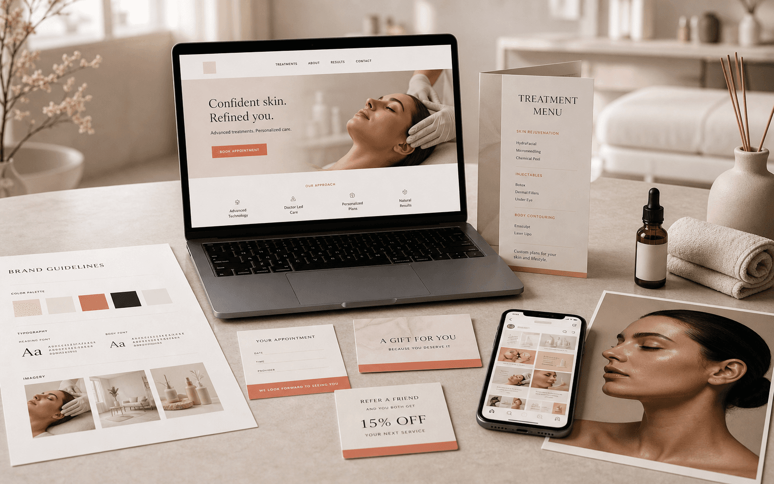
Generic image style weakens trust
Stock beauty imagery can make multiple med spas look interchangeable. In a dense NY/NJ market, that sameness is a real problem because clients often compare several providers in one sitting.
The better approach is to define an image system: treatment room details, product textures, clean interface screenshots, staff or provider moments, and social graphics that all feel related. The images do not need to be overly dramatic. They need to feel specific to the business.
Booking should feel calm, not pushy
A med spa website should make booking easy without making the visitor feel rushed. The most effective pages usually combine a clear call to action with enough context to make the action feel safe.
That means the booking page, consultation form, treatment menu, gift card page, and social profile link should all use the same design language. When those pieces look unrelated, the site may still get clicks, but the brand feels less premium.
Production details are part of the brand
The website is only one part of the client journey. Treatment menus, consultation sheets, gift cards, aftercare cards, and campaign graphics should reinforce the same brand system. A premium web experience loses strength if the printed or downloadable materials feel rushed.
Before launch or refresh, the site design should be connected to production-ready files for print, social, and booking touchpoints so the brand remains consistent after the visitor leaves the page.
Frequently asked questions
What makes a med spa website feel premium?
Clear layout, refined typography, consistent imagery, treatment education, reviews or trust signals, and simple booking paths.
Does a med spa need separate treatment pages?
Usually yes. Separate pages help clients understand each treatment and improve search visibility for specific services.
What should a med spa avoid on its homepage?
Avoid vague beauty language, buried booking paths, inconsistent image styles, and service sections that do not explain what the client should do next.
Should med spa print materials match the website?
Yes. Service menus, aftercare cards, gift cards, and consultation materials should feel connected to the same brand system as the website.
Need a sharper customer-facing system?
Improve consistency across the brand, website, and sales materials.
Visual Square helps NY/NJ businesses clean up the touchpoints customers actually see first, so the brand feels clearer, more credible, and easier to trust.
Talk through the refresh