

Article · Aug 28, 2026
Aftercare Cards Carry the Brand Too
How med spas can make aftercare cards, reminders, service pages, and follow-up messages feel like one careful customer experience.
8 min read
Aftercare communication is a brand moment because it arrives when a client is paying close attention. Med spas need clear, careful, consistent materials across cards, reminders, service pages, and follow-up messages without making unsupported claims.
In this article
- 01The card leaves with the client
- 02Premium tone does not excuse vague instructions
- 03The follow-up message should not change character
- 04Design has to respect the limits of the promise
- 05The quiet card may be the remembered piece
The card leaves with the client
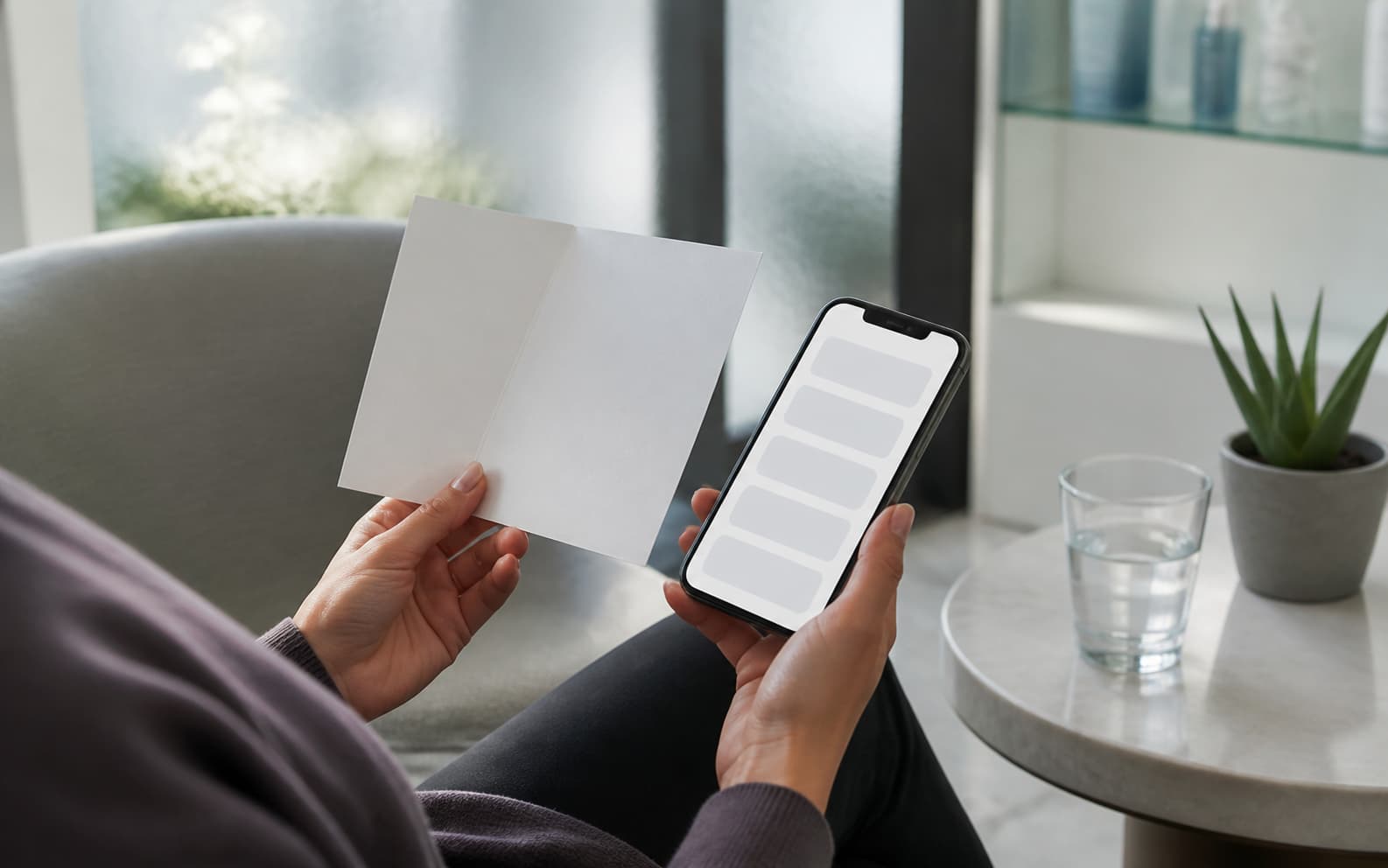
A med spa client may forget the exact phrasing on the service page. They may not remember which social post made the place feel polished. But the small card handed over after an appointment often travels home in a bag, sits on a counter, or gets photographed for later.
That card is not a decorative extra. It is part of the brand's voice at a sensitive moment. The client is looking for practical clarity: what to avoid, what to expect, who to contact, and how to recognize normal follow-up from a reason to ask a question. The design has to feel calm because the information has to be used.
Premium tone does not excuse vague instructions
Beauty and wellness brands sometimes confuse softness with clarity. The palette is gentle, the language is soothing, and the page looks expensive, but the practical instructions are buried or too vague to be useful.
For med spas, restraint is not only a style choice. It is a trust choice. FTC guidance around health-related advertising emphasizes substantiation for objective claims, and FDA cosmetic information distinguishes product claims from medical claims. A brand does not need to sound frightened by regulation, but it should avoid turning aftercare into wishful marketing language.
- Separate practical aftercare instructions from promotional language.
- Use a clear escalation path for questions without diagnosing in the design.
- Keep service-page expectations, consultation notes, and printed cards aligned.
- Avoid before-and-after promises or language the business cannot support.
The follow-up message should not change character
The weak point often appears after the appointment. The website is polished, the room is calm, and the printed card is careful. Then the reminder text arrives in a different voice, the email uses another format, and the staff note sounds improvised.
A better system treats aftercare as one communication family. The card, email, SMS, product-use cue, service page, consent handoff, and staff script can each be brief, but they should share order, tone, and visual hierarchy. Consistency is not decoration here. It prevents the client from wondering which message is the real one.

Design has to respect the limits of the promise
The temptation in competitive local markets is to make every touchpoint feel more dramatic. Bigger claims, sleeker cards, stronger words, more aspirational images. The problem is that aftercare is not the place for theater. It is the place where the brand proves it can be useful without overreaching.
Visual Square's design lens for this kind of material is practical: hierarchy first, then tone, then production. The most important information should be findable at a glance. The language should match what the business can responsibly say. The card should be easy to print, update, and hand out without inventing a different brand each time.
The quiet card may be the remembered piece
A useful audit starts by gathering every aftercare-related touchpoint in one place. Read the service page, consultation note, printed card, email, reminder, and staff script in order. Remove claims that are not supported. Fix mismatched tone. Put the same next-step logic everywhere.
The result may not be flashy. That is the point. When the client leaves, the card should not perform like an ad. It should behave like a careful business still paying attention after the appointment is over.
Frequently asked questions
Why are aftercare cards part of med spa branding?
They are customer-facing materials used after the appointment, when clients need clear instructions, realistic expectations, and a consistent business voice.
What should med spa aftercare communication include?
It can include clear instructions, what to avoid, expected timing, contact guidance, product-use cues, reminder messages, and staff handoff rules.
How should med spas handle claims in aftercare materials?
They should avoid unsupported promises and keep practical instructions separate from promotional language, especially when health-related claims are involved.
Need a sharper customer-facing system?
Improve consistency across the brand, website, and sales materials.
Visual Square helps NY/NJ businesses clean up the touchpoints customers actually see first, so the brand feels clearer, more credible, and easier to trust.
Talk through the refresh