
Article · Oct 1, 2026
Price Sheets Need Real Light
Why retail price sheets, labels, menus, and small selling details should be tested under the light customers actually see.
7 min read
A price sheet can look calm in a design file and fail inside a window, under a display bulb, or on a counter with glare. Retail design has to be checked in the light where customers decide.
In this article
- 01The file is not where the customer reads it
- 02Legibility is a brand promise
- 03Trends still have to pass the room
- 04Build a small lighting ritual
The file is not where the customer reads it
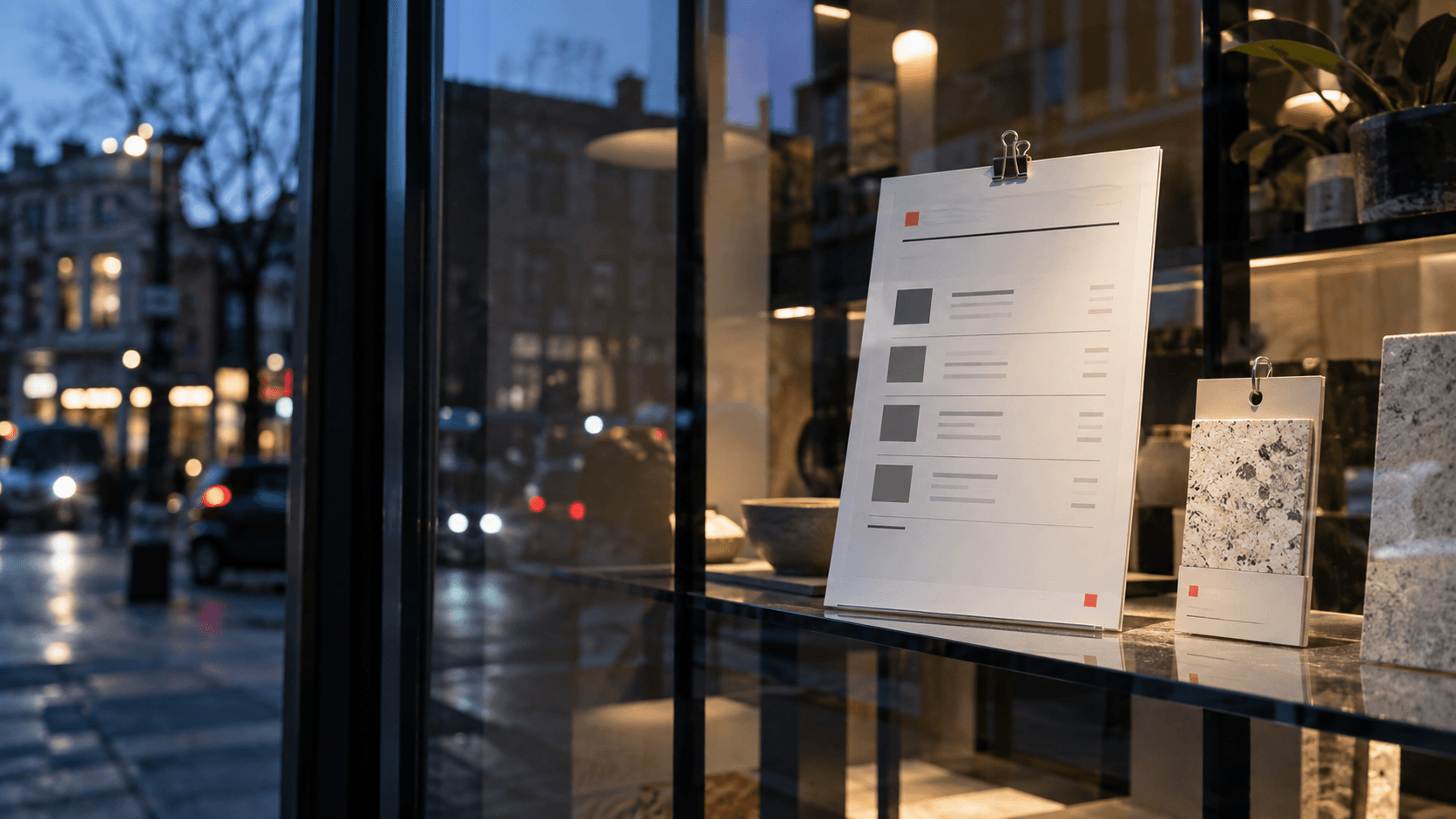
The price sheet looked perfectly reasonable on the screen. The type was balanced, the spacing was generous, and the color palette had the calm confidence everyone wanted. Then it went into the window display, behind glass, between a warm shelf light and a blue evening reflection from the street. The quiet gray line became a whisper. The pale accent turned into a smudge. The information still existed, but it no longer arrived.
This is a common retail problem because design approvals often happen in the gentlest possible environment: a bright monitor, a PDF preview, or a conference table. Customers meet the same material in a more difficult place. They see it through glass, under mixed bulbs, at an angle, while carrying a bag, with daylight shifting across the surface. The design has to survive that room.
Legibility is a brand promise
A hard-to-read price sheet does not only slow the sale. It changes the tone of the business. Customers may not think, the contrast ratio is weak. They think the store feels a little careless, or the item feels harder to evaluate than it should. That judgment is small, but retail is made of small judgments.
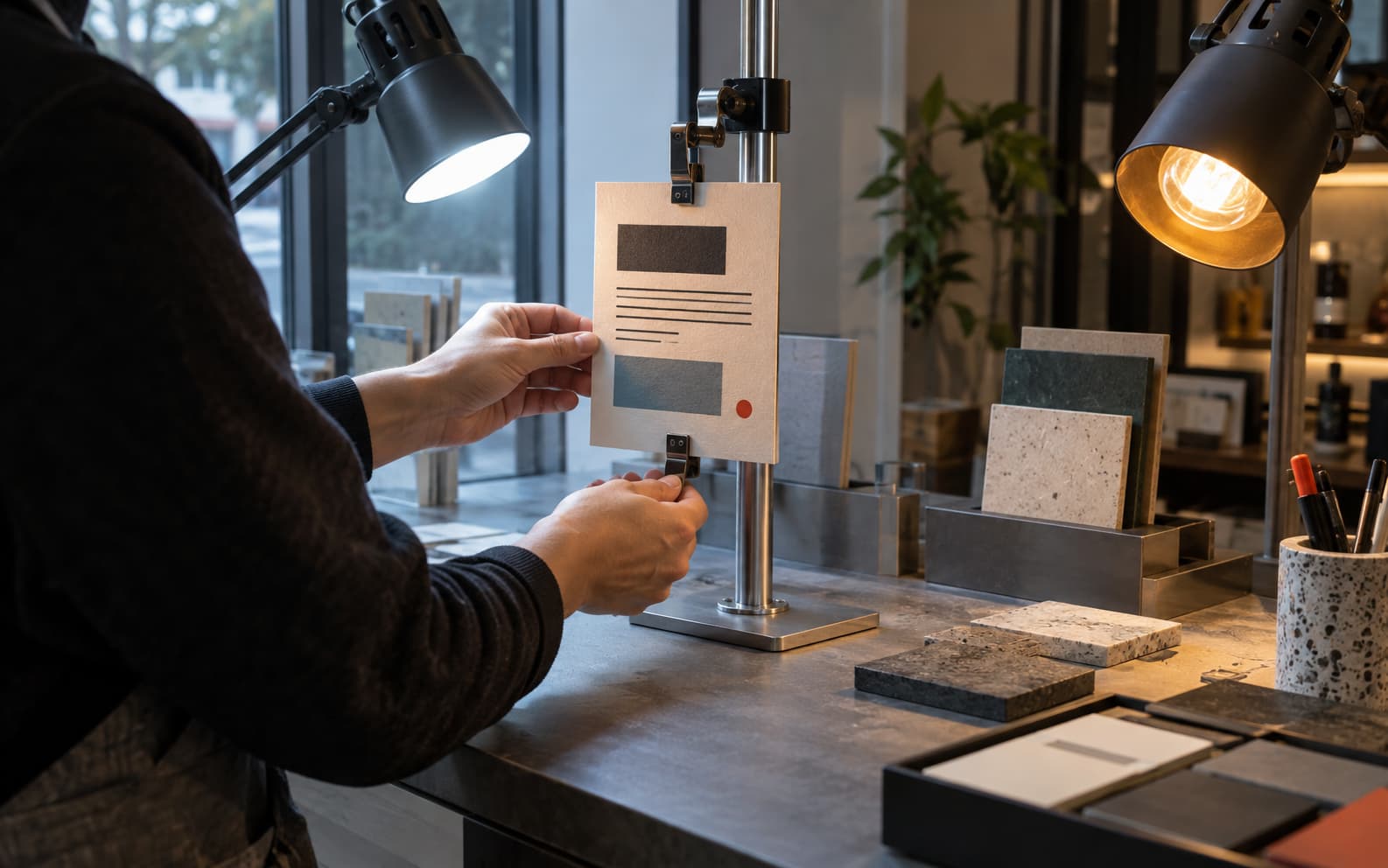
The practical standard is not whether the sign is beautiful in isolation. It is whether the customer can understand the choice without leaning in, guessing, or asking for help too early. W3C contrast guidance is useful as a floor for digital and printed planning, but the final check still needs the physical condition: stock color, finish, glass, bulb temperature, and viewing distance.
- Check the smallest useful information first: prices, sizes, care notes, options, dates, and QR cues.
- Test glossy and matte stock in the real fixture before committing to a full run.
- View the material from the customer side of the counter or window, not only from the staff side.
- Keep accent color for direction and emphasis, not for essential facts that must survive glare.
Trends still have to pass the room
The current visual direction across creative reports is moving toward tactile detail, richer color, and less generic polish. That is useful for small businesses because real material can separate a store from the bland sameness of template graphics. But texture and color are not excuses to make information fragile.
A smoky green, a deep plum, a warm amber, or a pale blue may be handsome in a trend report and weak in a north-facing window. A thin line may look elegant on a PDF and disappear on satin stock. The more refined the visual language, the more important the production test becomes.
Build a small lighting ritual
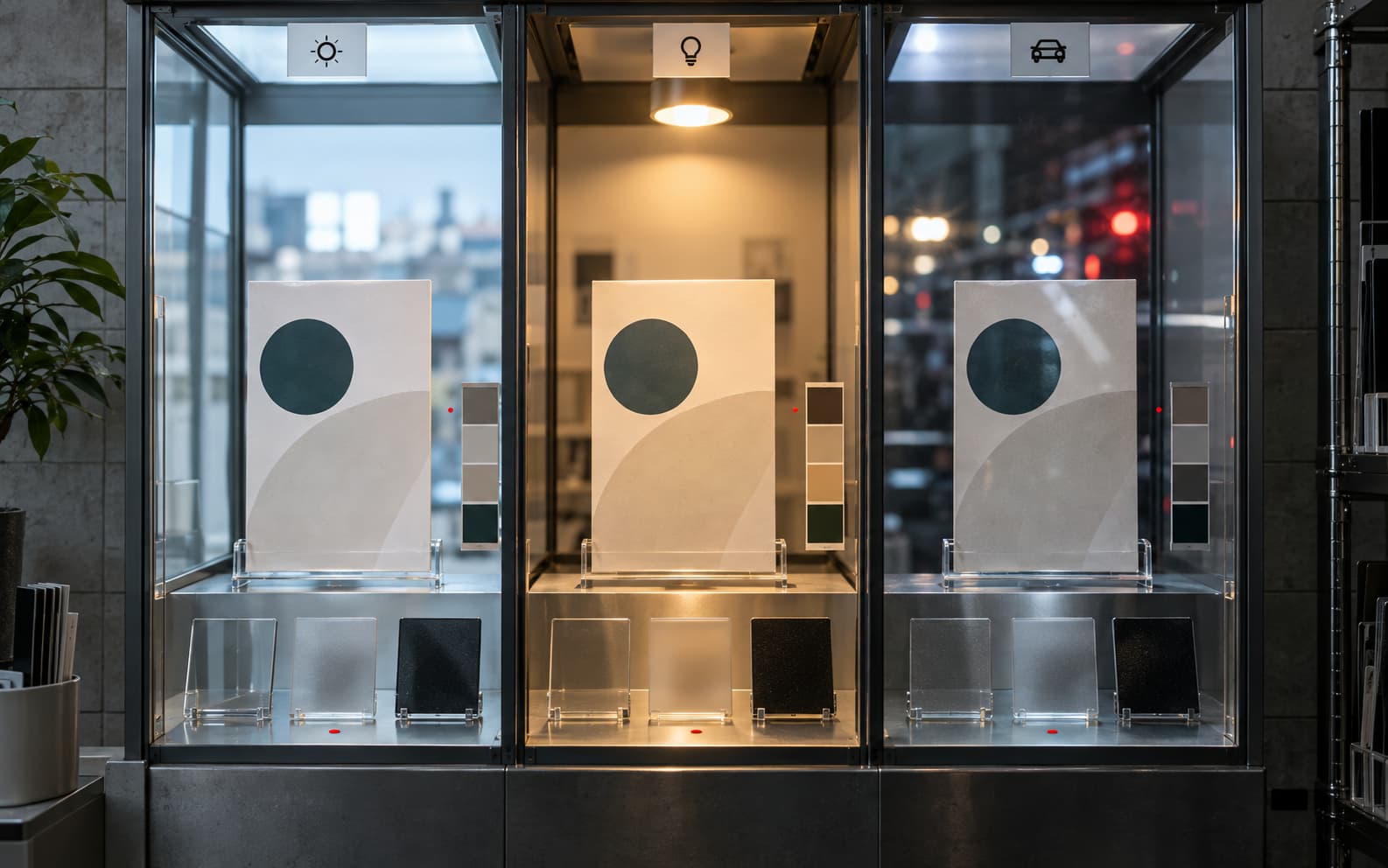
A store does not need a laboratory. It needs a ritual. Print the piece at size. Put it where the customer will see it. Look at it in morning light, afternoon glare, evening reflection, and the fixture light that stays on after dark. Ask what disappears first. Ask what the customer must know without effort. Then adjust the design before the full production run.
The price sheet in the window is not a minor piece of paper. It is a small contract with the passerby. When it survives the light, the business feels more composed. The customer does not need to admire the typography. They simply understand the offer, through the glass, before the door opens.
Frequently asked questions
Why should printed retail materials be tested under real lighting?
Store windows, display bulbs, glass, glare, and viewing distance can change contrast and legibility. Testing in place helps prevent important details from disappearing after production.
What retail materials need this kind of check?
Price sheets, shelf signs, menus, product labels, packaging inserts, QR cards, appointment cards, and showroom tags all benefit from real-light review.
Does this replace accessibility contrast checks?
No. Contrast guidance is a useful baseline, but physical materials still need review under the actual light, material, and viewing conditions customers experience.
Need a sharper customer-facing system?
Improve consistency across the brand, website, and sales materials.
Visual Square helps NY/NJ businesses clean up the touchpoints customers actually see first, so the brand feels clearer, more credible, and easier to trust.
Talk through the refresh