
Article · Aug 20, 2026
The Follow-Up Page Is Part of the Sale
Why confirmation pages, emails, reminders, intake cards, and staff handoffs should be designed as one customer-journey system.
8 min read
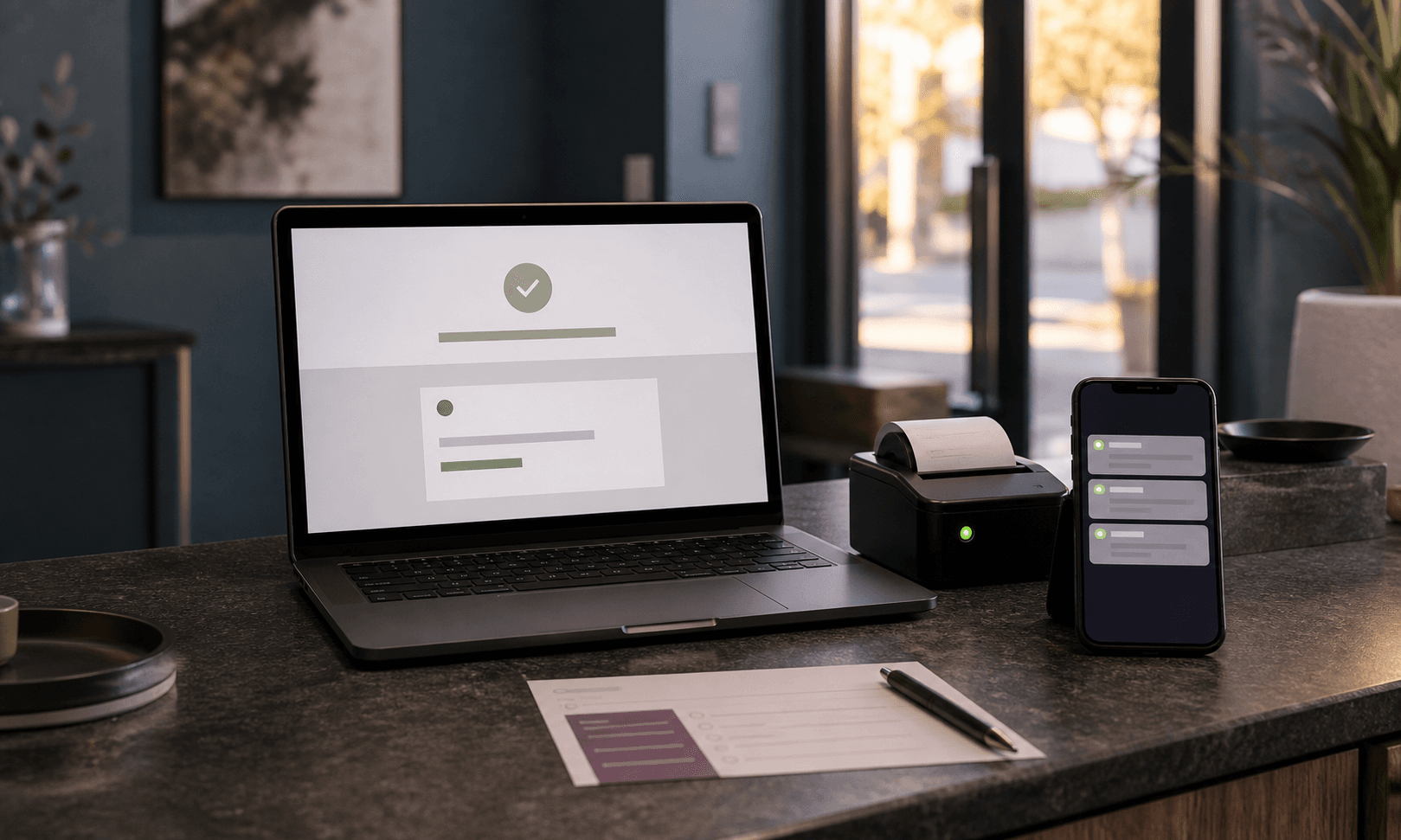
The moment after a form submit is not administrative dead space. It is where a local service business confirms the customer's decision, reduces doubt, and prepares the next human interaction.
In this article
- 01The sale does not end at the button
- 02A thank-you message is too small for the job
- 03The next message should feel like the same business
- 04Clarity after conversion protects the brand before service
- 05Design the handoff as carefully as the landing page
The sale does not end at the button
There is a small, strange silence after a customer submits a form. The button changes, the page thanks them, and then the business either keeps its composure or disappears into administrative fog. For a local service business, that silence matters.
The customer has not become less attentive because they clicked. They may be more attentive. They want to know whether the request went through, who will respond, how soon, what to prepare, and whether the business still feels as organized as it did before the form. The follow-up page is not a receipt. It is the first proof that the promise can survive contact.
A thank-you message is too small for the job
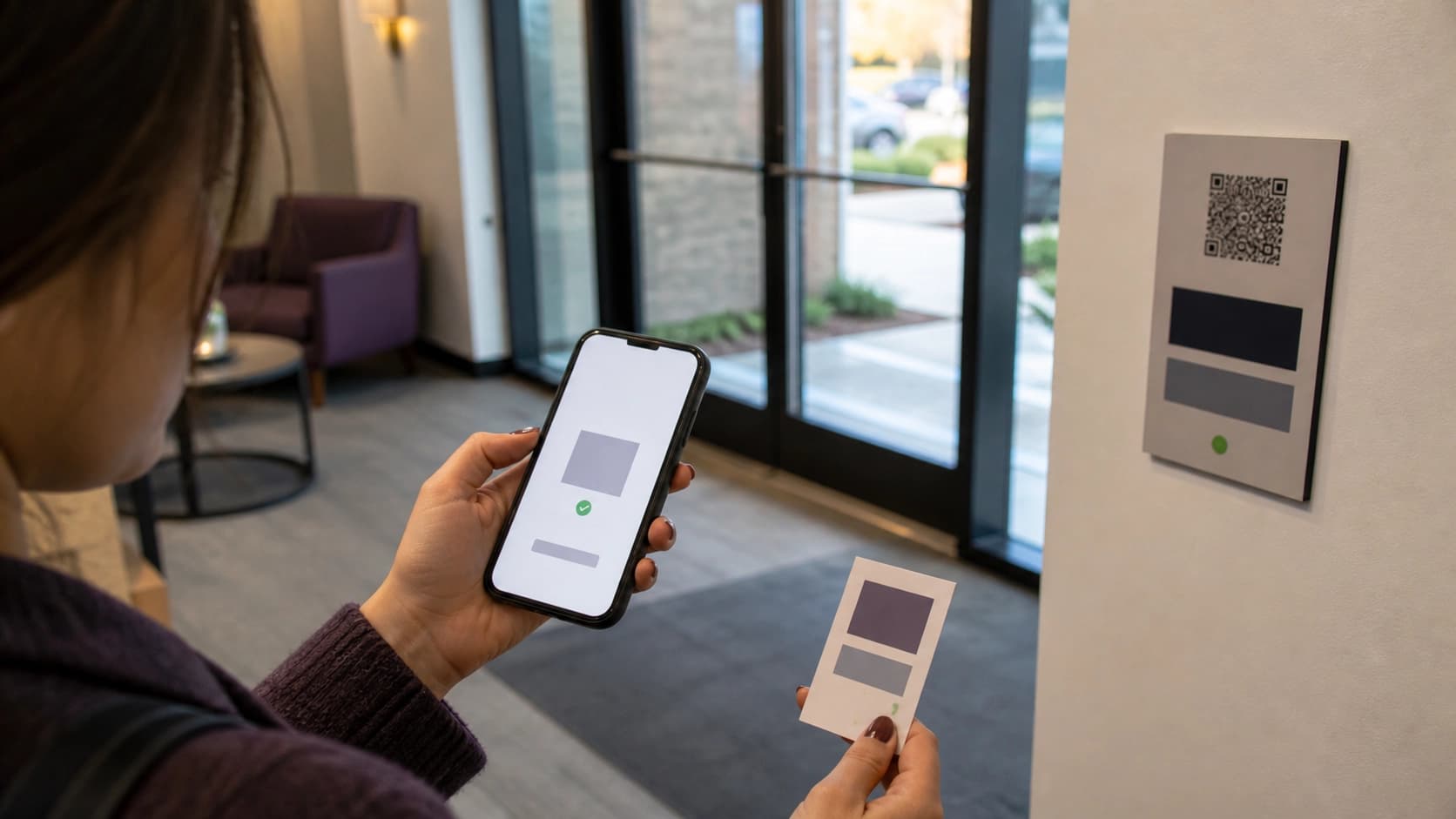
A polite thank-you line is fine, but it rarely carries enough information. A better confirmation moment gives the customer a short sequence: what was received, what happens next, when to expect contact, what they can do now, and how to recognize the business when the reply arrives.
Google's guidance for helpful content is aimed at search, but the principle travels well: useful information should be created for people first. A confirmation page is one of the most people-first pages a business owns. The visitor is no longer browsing. They are waiting.
- Confirm the action in plain language without inventing certainty.
- Set a realistic response window if the business can honor it.
- Give one useful next step instead of five promotional distractions.
- Make the email, SMS, and staff script match the page.
The next message should feel like the same business
Many customer journeys are carefully designed until the conversion, then left to whatever the scheduling tool, inbox template, or staff note happens to say. The website sounds calm; the automatic email sounds generic; the intake card sounds legalistic; the reminder text sounds abrupt.
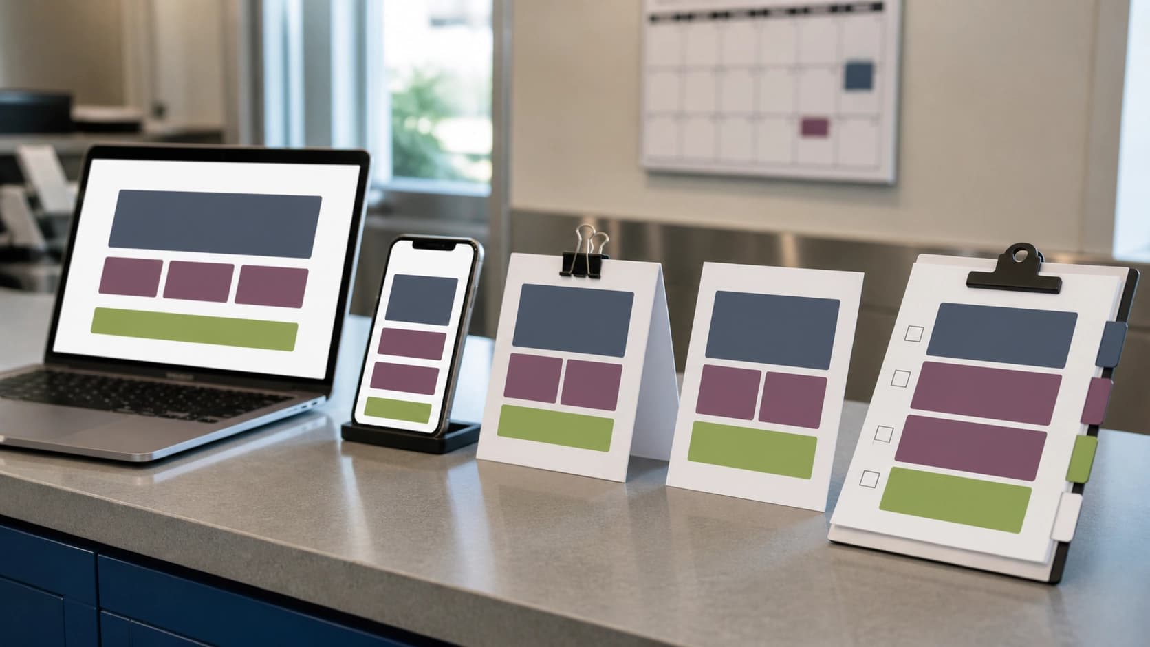
That drift is fixable. The business needs a follow-up kit, not just a page. The kit includes the confirmation screen, automatic email, reminder text, intake sheet, printed card, and staff handoff note. Each piece can be short. Each piece should share the same order of information and the same level of care.
Clarity after conversion protects the brand before service
The vulnerable part of a service brand is often the gap between interest and delivery. A patient, client, diner, shopper, or property buyer has raised a hand. The business has not yet delivered the service. In that gap, tone and process do heavy work.
This is not a place for inflated promises. It is a place for useful restraint. Say what the business knows. Do not guarantee what it cannot control. Tell the customer what will happen next. Keep the visual hierarchy calm. If there is a delay, make the path back to contact obvious.
Design the handoff as carefully as the landing page
The practical audit is simple. Submit the form as a customer would. Read the confirmation page, the email, the reminder, and the printed material in order. Then ask whether the business still sounds like itself after the button.
If the answer is no, the fix may be small: a clearer confirmation headline, a better response window, one preparatory note, an email header that matches the page, and a staff checklist that uses the same language. The sale does not end at the button. It becomes easier to keep, or easier to doubt.
Frequently asked questions
What should a confirmation page include after a form submit?
It should confirm what was received, explain the next step, set an honest response expectation, provide useful preparation, and connect to the follow-up email or reminder.
Why does follow-up design matter for local service businesses?
Customers often judge organization and trust between inquiry and service delivery. Clear follow-up reduces uncertainty before the human interaction begins.
What assets belong in a follow-up kit?
A follow-up kit can include the confirmation page, automatic email, reminder text, intake form, printed card, staff handoff note, and matching visual/copy rules.
Need a sharper customer-facing system?
Improve consistency across the brand, website, and sales materials.
Visual Square helps NY/NJ businesses clean up the touchpoints customers actually see first, so the brand feels clearer, more credible, and easier to trust.
Talk through the refresh