
Article · Sep 1, 2026
A Color Palette Has to Survive Bad Lighting
Why brand colors should be tested on screens, print, fabric, signage materials, and real lighting before they become a public system.
8 min read
A palette is not finished when it looks good in a clean file. Brand colors need to survive phone screens, low-quality prints, window glare, LED interiors, fabric, packaging, and accessibility checks before they can be trusted in daily use.
In this article
- 01The approved color is rarely where the customer sees it
- 02Contrast is a customer-service decision
- 03Material changes the personality of color
- 04Trends are inputs, not instructions
- 05Approve the palette after it misbehaves
The approved color is rarely where the customer sees it
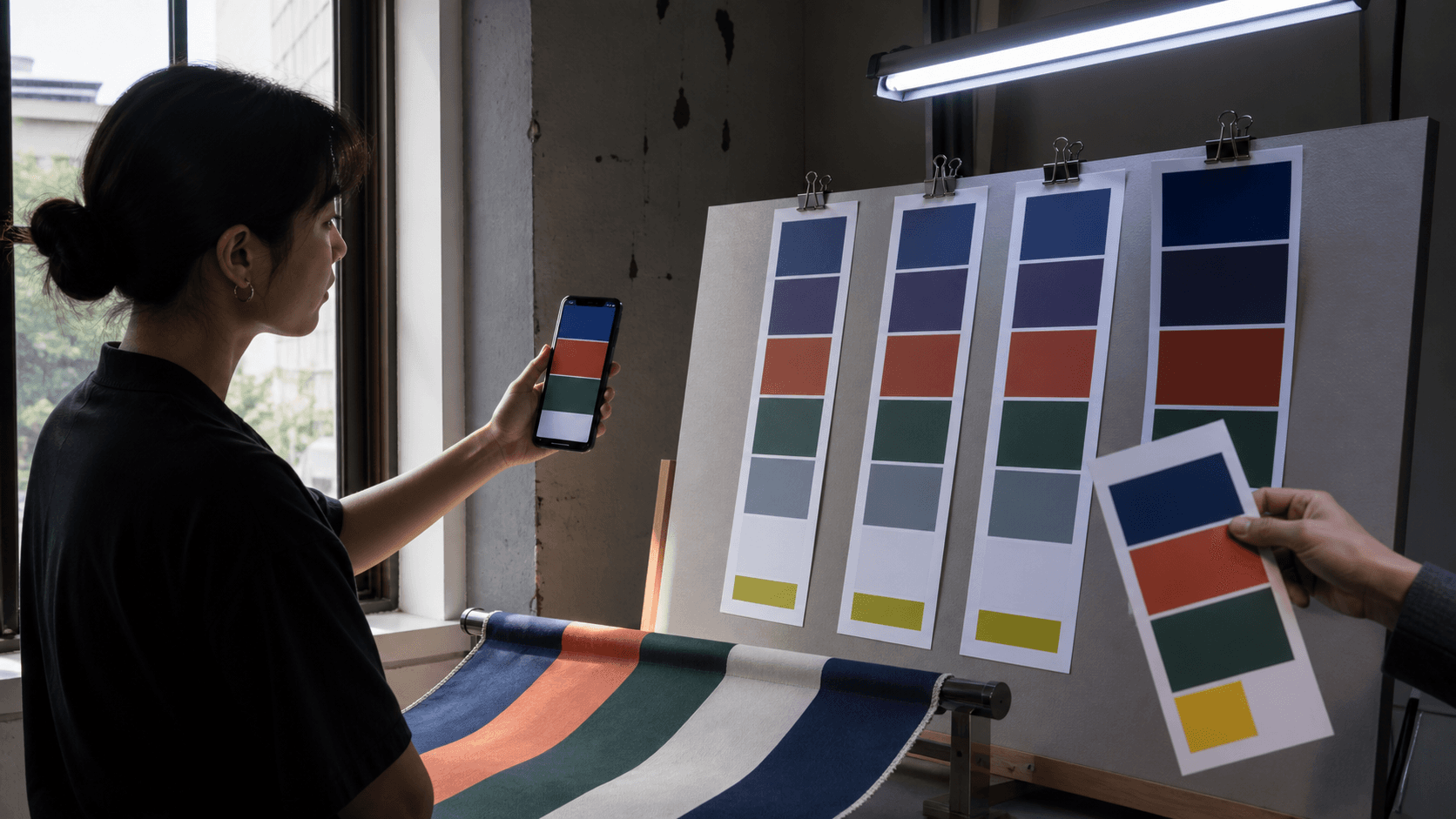
A palette can look excellent in a design file at noon on a calibrated display. Then it walks into the real world and immediately begins negotiating. The navy dulls under a cheap LED. The green shifts on uncoated paper. The orange looks confident on a phone and tired on fabric. The pale background that felt elegant in the deck becomes unreadable in a window reflection.
This is not a failure of taste. It is the normal life of color. Customers meet a brand through screens, signs, menus, packaging, labels, cards, uniforms, awnings, and quick social crops. A palette that has only been approved in one perfect condition is still a theory.

Contrast is a customer-service decision
Accessibility standards such as WCAG contrast guidance give designers a useful floor, but the business reason is even simpler: people should be able to read what the business needs them to read. Hours, prices, service names, safety notes, directional cues, and calls to action should not depend on perfect light or perfect eyesight.
Color is often discussed as mood. It is also infrastructure. If the service label disappears on a phone, the offer becomes harder to understand. If the card background makes small type shimmer, the printed piece starts to feel less careful. If a sign color collapses at dusk, the brand has lost function before it has lost beauty.
- Test primary and secondary colors on both dark and light backgrounds.
- Check small type, buttons, captions, labels, and printed fine print.
- Review colors under daylight, warm interior light, cool LED, and shadow.
- Define fallback colors for production methods that shift the palette.
Material changes the personality of color
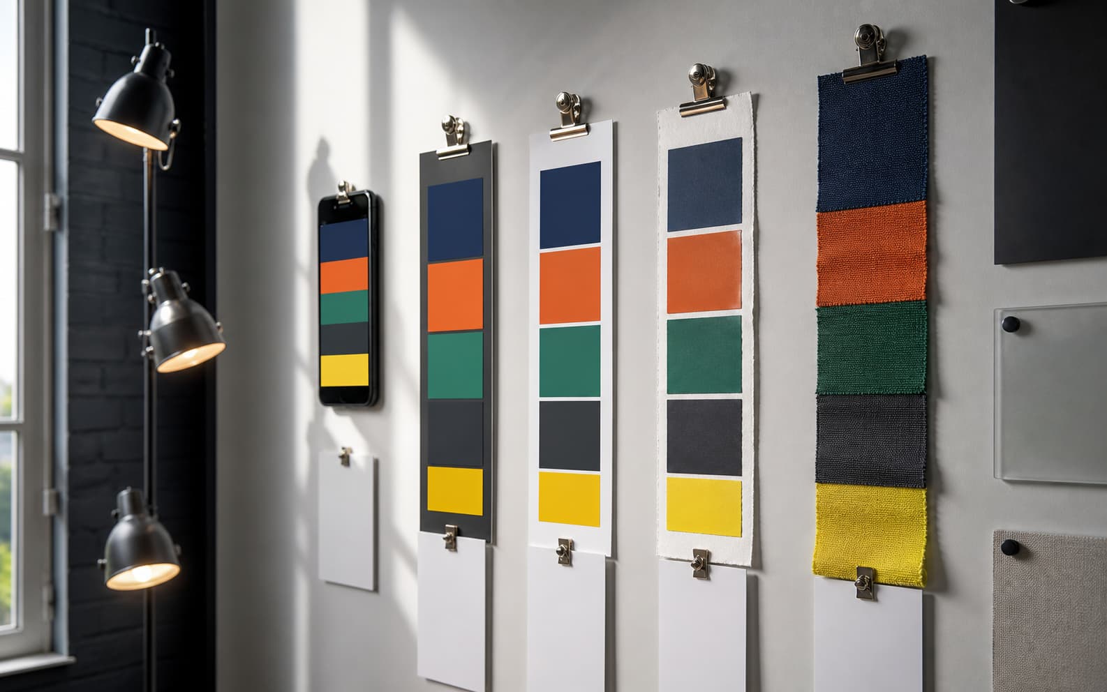
The same orange is not the same orange on coated paper, uncoated stock, vinyl, fabric, acrylic, ceramic, or a backlit screen. Gloss can make a color feel sharper. Soft paper can make it feel quieter. Fabric can absorb energy. Frosted acrylic can make a dark shade feel more expensive or more difficult to read.
This is why production belongs inside brand strategy. A small business does not need an enormous color manual, but it does need rules for the materials it actually uses. A restaurant may need menu and label rules. A med spa may need card and product-shelf rules. A retail showroom may need tag, window, and fabric rules.
Trends are inputs, not instructions
Creative trend reports are useful because they show the cultural weather. Current public reports point toward expressive color, tactile materials, local specificity, and less generic polish. Those signals can help a brand avoid looking sealed inside an old template.
But a trend is not a palette. The job is to translate the signal into a system that fits the business. A law office, cafe, med spa, retail showroom, and real estate team may all learn from the same visual culture and still need different color behavior. The test is not whether the palette looks current for one week. The test is whether it can keep working after production starts.
Approve the palette after it misbehaves
The practical audit is unglamorous and useful. Print the palette on the paper the business will use. Put it on a phone. View it in morning light, bad office light, and evening shadow. Place type over it. Photograph it. Export a small social crop. Ask which colors keep their job and which ones need rules.
A palette that survives that treatment may become quieter than the first file. It may also become stronger. The best brand colors do not only charm the approval meeting. They keep helping the customer read the sign, understand the offer, and recognize the business when the lighting is doing its worst.
Frequently asked questions
Why should brand colors be tested before launch?
Colors can shift across screens, paper, fabric, signage materials, and lighting. Testing prevents readability and consistency problems after production begins.
What color tests should a small business run?
Test colors on phone screens, printed cards, signage or label materials, dark and light backgrounds, small type, and the actual lighting where customers will see them.
How does contrast affect brand design?
Contrast affects whether customers can read service names, hours, prices, directions, and calls to action. It is both a design and customer-experience issue.
Need a sharper customer-facing system?
Improve consistency across the brand, website, and sales materials.
Visual Square helps NY/NJ businesses clean up the touchpoints customers actually see first, so the brand feels clearer, more credible, and easier to trust.
Talk through the refresh