

Article · Sep 22, 2026
Brand Rules Should Fit on the Counter
Why small businesses need practical one-page brand rules for labels, cards, signs, social crops, and daily production decisions.
8 min read
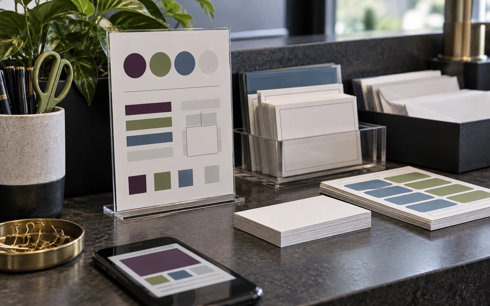
A brand guide is only useful if the business can use it while making everyday materials. A counter card can turn color, type, spacing, image, and file rules into decisions that survive labels, signs, cards, web crops, and staff materials.
In this article
- 01The brand guide is too far from the work
- 02One page can carry the daily decisions
- 03Rules are most valuable at the edges
- 04Vendors need rules they can follow
- 05Start with the five questions that keep returning
The brand guide is too far from the work
A brand guide can be beautiful and still be functionally absent. It sits in a folder, or in a PDF nobody opens while printing labels, cutting vinyl, making a staff badge, updating a social post, or ordering another stack of cards. The rules exist. The counter does not feel them.
For many local businesses, the practical question is not whether a 60-page manual can define the brand. It is whether the person making tomorrow's material can answer a few ordinary questions without guessing: which color, how much space, which crop, which type size, which file, which language version.
One page can carry the daily decisions
The counter card is not a replacement for strategy. It is strategy translated into daily production. It says which colors are primary, which combinations are too weak, how close the mark or type can sit to an edge, how photo crops should behave, how Korean and English layouts get room, and which file should be sent to a printer or sign vendor.
Canva's current design-trend language points toward cleaner systems and less overworked polish; Adobe's creative trend reporting keeps emphasizing sensory texture, human connection, and local specificity. Those broad signals are useful, but the small business still needs a rule it can use at 4 p.m. when a label order is due.
- Put the most-used colors, type sizes, and spacing examples on one page.
- Show good and bad crop behavior without using fictional client work.
- Name the correct file formats for print, web, signs, and social.
- Give Korean copy enough room instead of shrinking it into the English layout.
Rules are most valuable at the edges
Brand consistency rarely breaks on the homepage first. It breaks on the edge pieces: appointment cards, labels, counter signs, window decals, staff badges, email headers, social thumbnails, packaging stickers, and the PDF someone sends because it was close enough.
These pieces are small, but they are frequent. They create the working memory of the brand. A customer may never see the original strategy deck. They will see the pickup card, the label, the window cue, the receipt insert, and the social crop that gets forwarded in a text message.

Vendors need rules they can follow
A printer, sign shop, web contractor, photographer, or staff member should not have to interpret the brand from memory. Vendor-ready rules reduce avoidable back-and-forth. They also prevent the strange substitutions that happen when nobody knows whether a color shift, crop, paper choice, or low-resolution file is acceptable.
This is especially useful for bilingual NY/NJ businesses. English and Korean versions often need different line breaks, different rhythm, and sometimes different formats. A counter card can make that difference normal instead of treating it as an emergency every time a small material changes.
Start with the five questions that keep returning
The easiest way to build the card is to collect the questions that come up again and again. Which logo file should I use? Can this color sit on that background? How small can the type be? Where should the photo crop? Does the Korean version need a separate layout?
Answer those questions with examples the business can keep near the work. The brand guide may still live in a folder. The counter card belongs where labels are packed, signs are checked, cards are reordered, and the next small decision tries to become a habit.
Frequently asked questions
What is a brand rules counter card?
It is a compact one-page reference that turns brand strategy into daily production decisions for color, type, spacing, crops, file formats, and bilingual layouts.
Do small businesses still need a full brand guide?
Some do, especially during larger launches or multi-location growth. But many teams also need a shorter working reference that can be used during everyday production.
What should be included first?
Start with the rules that prevent the most common mistakes: colors, type scale, spacing, image crop examples, file formats, print notes, and language-layout guidance.
Need a sharper customer-facing system?
Improve consistency across the brand, website, and sales materials.
Visual Square helps NY/NJ businesses clean up the touchpoints customers actually see first, so the brand feels clearer, more credible, and easier to trust.
Talk through the refresh